
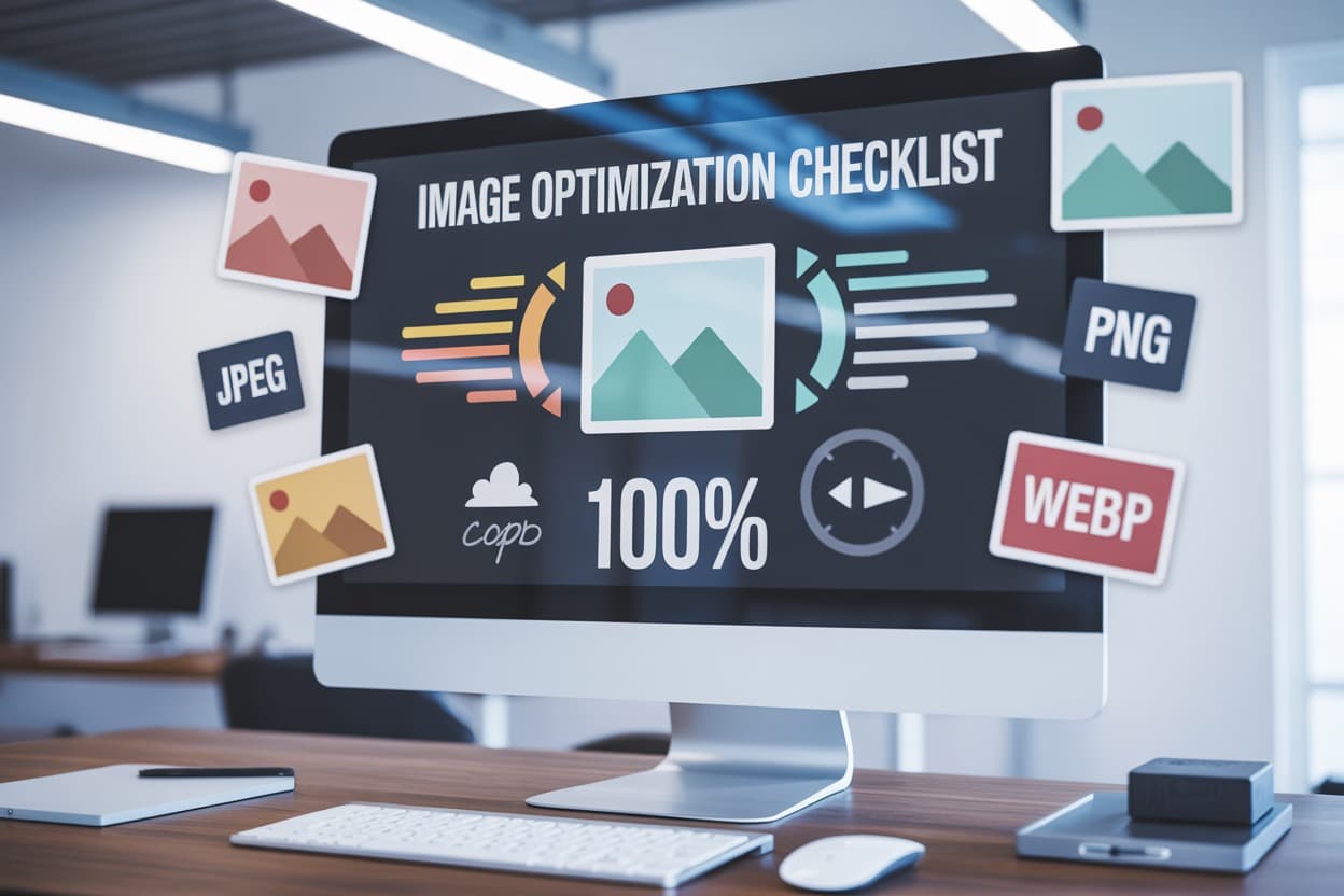
Your website's speed can make or break your user experience, and images are often the biggest culprits behind slow loading times. If you're a web developer, designer, or business owner looking to boost your site's performance, mastering image optimization is essential for faster website loading and better search rankings.
This comprehensive image optimization checklist will help you cut through the confusion and implement proven website speed optimization strategies. You'll discover how to compress images without sacrificing visual quality, choose the best image file formats for web performance, and implement lazy loading images to dramatically improve your load times. We'll also cover advanced techniques like using a CDN for images and optimizing your image metadata to squeeze every bit of performance from your visual content.
Image optimization is one of the fastest ways to improve website load speed and performance.
- Choose the right format, use WebP for most images, JPEG for photos, PNG only for transparency, and AVIF for cutting-edge compression.
- Compress images without sacrificing quality, use lossless for brand assets and lossy for photos, and keep quality around 75-85%.
- Resize images to the exact display size and use responsive versions with srcset to avoid wasting bandwidth.
- Improve loading with lazy loading, progressive JPEGs, preloading critical images, and WebP with fallbacks.
- Use CDNs and caching to speed up delivery for global users and repeat visitors, and strip unnecessary image metadata to reduce file sizes.
Choose the Right Image Format for Maximum Speed
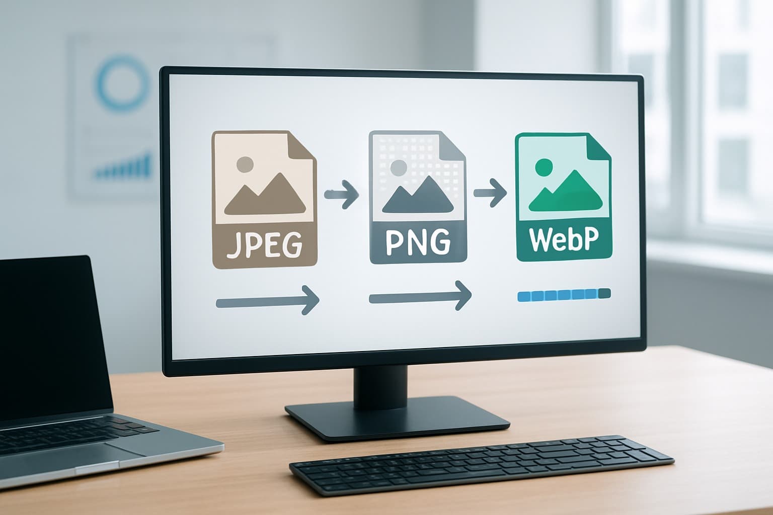
Use WebP for modern browsers and superior compression
WebP delivers exceptional image compression while maintaining visual quality, making it your go-to format for website speed optimization. This Google-developed format reduces file sizes by 25-35% compared to JPEG and up to 50% compared to PNG, directly improving your website loading times.
Your modern browsers (Chrome, Firefox, Safari, and Edge) all support WebP natively, covering over 95% of web traffic. When you implement WebP, you're giving your visitors significantly faster load speeds without compromising image clarity. The format excels at both lossy and lossless compression, adapting perfectly to your specific image needs.
To maximize WebP benefits, implement fallback solutions using the <picture> element. This ensures older browsers receive JPEG or PNG versions while modern browsers enjoy WebP's speed advantages.
Leverage JPEG for photographs with complex color schemes
JPEG remains your best choice for photographs containing millions of colors, gradients, and complex textures. Your portrait photography, landscape images, and detailed product shots compress efficiently with JPEG's lossy algorithm, maintaining excellent visual quality at reduced file sizes.
When optimizing JPEG images, aim for quality settings between 75-85% for the sweet spot between file size and visual appeal. Your photographs will retain their natural appearance while achieving substantial compression ratios. JPEG's widespread browser support means universal compatibility across all devices and platforms.
Avoid JPEG for images with sharp edges, text overlays, or simple graphics, as these elements may appear blurred or artifacts may become visible.
Select PNG only when transparency is essential
PNG serves a specific purpose in your image optimization strategy - transparent backgrounds. Your logos, icons, and graphics requiring transparency need PNG's lossless compression to maintain crisp edges and perfect transparency channels.
However, PNG files are significantly larger than their JPEG or WebP counterparts. Use PNG-8 for simple graphics with limited colors (under 256) and PNG-24 for complex images requiring transparency. Your file sizes will thank you for this strategic approach.
Consider converting solid-background PNG images to WebP or JPEG formats, reserving PNG exclusively for transparency requirements. This simple switch can reduce your image file sizes by 60-80%.
Implement AVIF for cutting-edge performance gains
AVIF represents the future of web image formats, offering compression rates 50% better than JPEG while supporting features like transparency and animation. Your forward-thinking website can benefit from AVIF's superior compression techniques and broader color gamut support.
Browser support for AVIF continues expanding, with Chrome, Firefox, and Opera already supporting the format. Implement AVIF as your primary format with WebP and JPEG fallbacks to ensure comprehensive browser coverage.
The format excels particularly with high-resolution images and complex photographs, where its advanced compression algorithms deliver remarkable file size reductions. Your users will experience faster loading times, especially on mobile connections where bandwidth matters most.
| Format | Compression | Transparency | Browser Support | Best Use Case |
|---|---|---|---|---|
| WebP | Excellent | Yes | 95%+ | General purpose |
| JPEG | Good | No | Universal | Photographs |
| PNG | Poor | Yes | Universal | Graphics with transparency |
| AVIF | Superior | Yes | Growing | High-resolution images |
Compress Images Without Sacrificing Visual Quality

Apply Lossless Compression for Critical Brand Images
When you're dealing with your company logo, product showcase images, or any visuals that represent your brand identity, you need compression that maintains every single pixel. Lossless compression reduces your file sizes without throwing away any image data, making it perfect for graphics where quality can't be compromised.
Your best bet for lossless compression is the PNG format, especially for images with sharp edges, text overlays, or transparent backgrounds. Tools like TinyPNG and ImageOptim can shrink your PNG files by 20-50% without any visual degradation. For your brand assets, this approach protects your professional image while still boosting website speed optimization.
Consider using WebP lossless for modern browsers - it typically delivers 25-35% smaller file sizes compared to PNG while maintaining identical quality. You can set up fallbacks for older browsers to ensure your critical images display perfectly across all devices.
Use Lossy Compression Strategically for Web Performance
Your blog photos, background images, and decorative visuals are prime candidates for lossy compression. This technique removes image data that your visitors won't notice, dramatically reducing file sizes for faster website loading.
JPEG remains your go-to format for photographs and complex images with many colors. When you apply lossy compression smartly, you can cut file sizes by 60-80% while keeping images that look great to your audience. Focus on compressing images that support your content rather than define your brand.
WebP lossy compression offers even better results - you'll typically see 25-50% smaller files compared to JPEG at the same visual quality level. Tools like Squoosh and Compress.io let you preview exactly how your images will look before you commit to the compression settings.
Set Optimal Quality Levels Between 75-85% for Best Results
Finding the sweet spot for image compression techniques means balancing file size with visual appeal. Quality levels between 75-85% consistently deliver the best ratio of small file sizes to crisp, professional-looking images.
At 85% quality, your images maintain excellent detail while reducing file size by approximately 50-70% compared to uncompressed versions. This setting works perfectly for hero images and important product photos where you need to optimize images for web without sacrificing the wow factor.
When you drop to 75% quality, you'll notice more aggressive file size reduction - often 70-85% smaller than the original. This level works well for supporting images, thumbnails, and gallery photos where speed matters more than pixel-perfect detail.
| Quality Setting | File Size Reduction | Best Use Cases |
|---|---|---|
| 85% | 50-70% | Hero images, product photos |
| 80% | 60-75% | Blog images, feature photos |
| 75% | 70-85% | Thumbnails, gallery images |
Test different quality levels with your specific images - some photos handle lower quality settings better than others. Your compression tool's preview feature helps you spot the exact point where quality becomes noticeably degraded.
Resize Images to Match Display Requirements
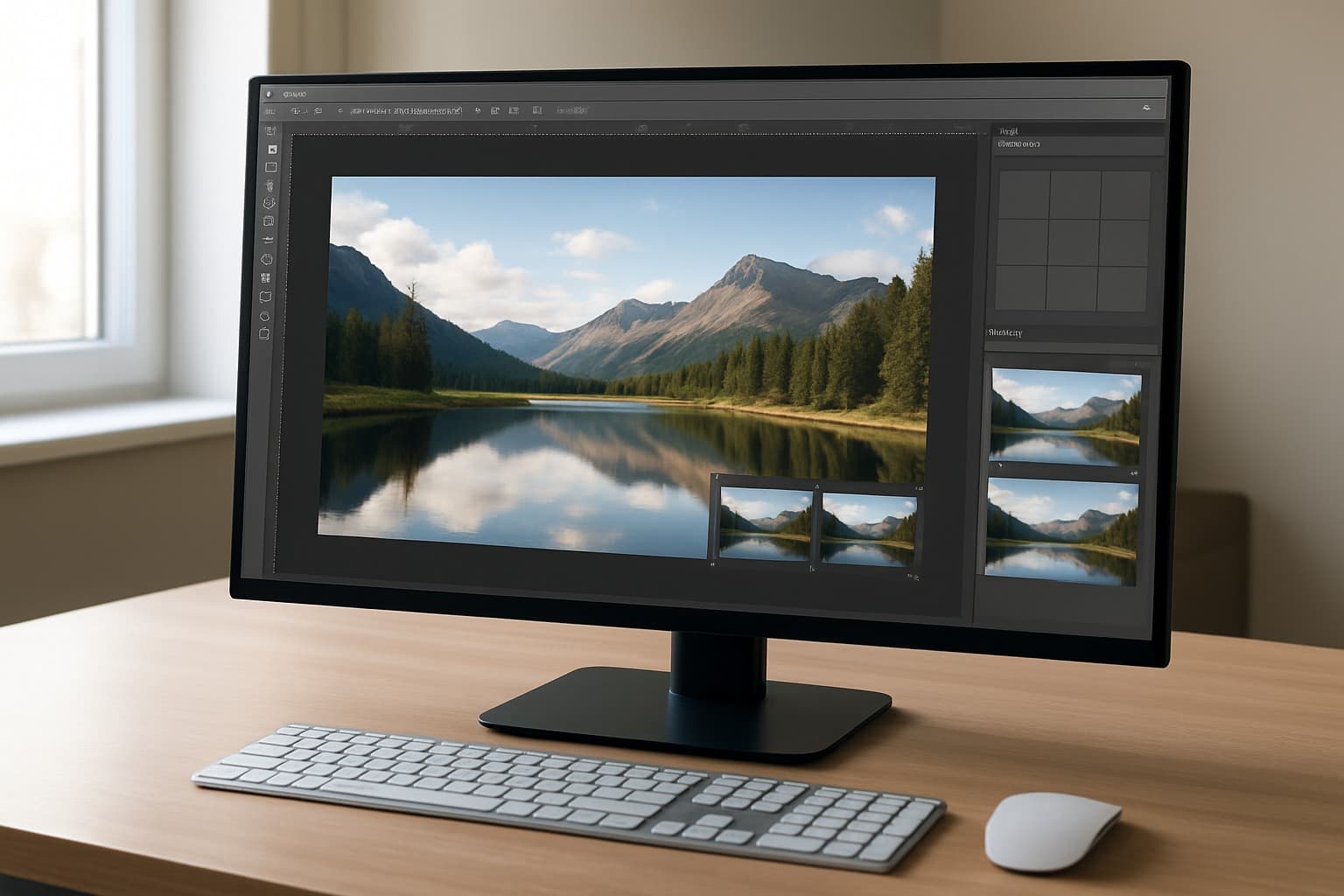
Scale images to exact pixel dimensions needed
Your image dimensions directly impact your website's loading speed. When you upload a 3000x2000 pixel image but only need it to display at 600x400 pixels, you're forcing visitors to download unnecessary data. This wastes bandwidth and slows down your site significantly.
Start by checking the actual display size of your images across different pages. If your blog posts show images at 800 pixels wide, don't use images that are 1920 pixels wide. You can use browser developer tools to inspect elements and see the exact dimensions your images are rendered at.
Most image editing software allows you to resize images to specific pixel dimensions. Adobe Photoshop, GIMP, and online tools like Canva make this process straightforward. When you resize images to match their display requirements exactly, you can reduce file sizes by 60-80% without any visible quality loss.
Create multiple sizes for responsive design breakpoints
Modern websites need to look great on smartphones, tablets, and desktop computers. Your image optimization strategy should include creating multiple versions of each image to match these different screen sizes and resolutions.
Consider these common breakpoints when creating your image variations:
| Device Type | Screen Width | Recommended Image Width |
|---|---|---|
| Mobile | 320-768px | 400-800px |
| Tablet | 768-1024px | 800-1200px |
| Desktop | 1024px+ | 1200-1600px |
Using HTML's srcset attribute, you can serve the appropriate image size based on the user's device. This technique, called responsive images, ensures mobile users don't download massive desktop-sized images. Here's a simple example:
<img src=“image-800w.jpg“ srcset=“ image-400w.jpg 400w, image-800w.jpg 800w, image-1200w.jpg 1200w “ alt=“Your image description“ />
Avoid browser-based resizing that wastes bandwidth
Never rely on CSS or HTML attributes to resize your images. When you set width=“300“ on a 1200-pixel-wide image, the browser still downloads the full-size file and then shrinks it for display. This approach wastes your visitors' data and creates unnecessary loading delays.
Browser-based resizing also produces lower-quality results compared to proper image editing software. Images that are resized by the browser often appear blurry or pixelated, especially on high-resolution displays.
Instead of using CSS to make images smaller, prepare your images at the correct size before uploading them to your website. This approach gives you better control over image quality while dramatically improving your website speed optimization. Your visitors will appreciate the faster loading times, and search engines will reward your site with better rankings due to improved web performance optimization.
Remember to test your images across different devices to make sure they look sharp and load quickly on all screen sizes.
Implement Advanced Loading Techniques

Enable Lazy Loading for Below-the-Fold Images
Lazy loading is one of the most effective website speed optimization techniques you can implement. Instead of loading all images when a page first loads, you only load images as users scroll down and approach them. This dramatically reduces your initial page load time and saves bandwidth for both you and your visitors.
You can implement lazy loading using the native loading=“lazy“ attribute in modern browsers, or use JavaScript libraries like LazyLoad or Intersection Observer API for broader browser support. The beauty of this approach is that users won't notice any difference in their browsing experience, but your page performance scores will improve significantly.
When setting up lazy loading, make sure to exclude above-the-fold images from this technique. You want those critical images to load immediately since users see them right away. Focus lazy loading on images that appear lower on the page, in sidebars, or in content sections that require scrolling to reach.
Use Progressive JPEG Loading for Better User Experience
Progressive JPEGs load in multiple passes, showing a low-quality version first that gradually improves in quality. This creates a much better user experience compared to standard JPEGs that load from top to bottom in a single pass. Users can see the full image outline immediately, even on slower connections.
You can convert your existing JPEGs to progressive format using image optimization tools or photo editing software. Most modern image compression techniques support this format, and the file sizes remain virtually identical to standard JPEGs. The perceived loading speed improves dramatically because users see something meaningful right away rather than waiting for the entire image to render.
This technique works particularly well for hero images, product photos, and other important visuals where you want to maintain user engagement during loading.
Preload Critical Above-the-Fold Images
Your most important images deserve special treatment. By preloading critical above-the-fold images, you ensure they're ready to display the moment users need them. This is especially important for hero images, logos, and key product photos that users expect to see immediately.
Use the <link rel=“preload“ as=“image“ href=“your-image.jpg“> tag in your HTML head section to tell browsers to download these images with high priority. You can also use JavaScript to preload images dynamically based on user behavior or device conditions.
Be selective with preloading – only choose images that are truly critical for the initial user experience. Preloading too many images can actually slow down your page by competing for bandwidth with other important resources.
Deploy WebP with JPEG Fallbacks for Browser Compatibility
WebP images offer superior compression compared to traditional formats, often reducing file sizes by 25-50% without visible quality loss. However, you need to provide fallbacks for browsers that don't support WebP yet.
The <picture> element gives you the perfect solution for optimize images for web with multiple format support:
<picture> <source srcset=“image.webp“ type=“image/webp“> <img src=“image.jpg“ alt=“Description“> </picture>
Modern browsers will load the WebP version, while older browsers automatically fall back to the JPEG. This approach maximizes your web performance optimization efforts while maintaining compatibility across all user devices and browsers.
You can automate WebP generation using build tools, CDNs, or server-side solutions that convert images on-the-fly based on browser capabilities.
Leverage Content Delivery Networks and Caching

Distribute images through global CDN networks
Your website's images need to reach visitors worldwide in milliseconds, not seconds. Content Delivery Networks (CDNs) make this possible by storing copies of your images on servers scattered across the globe. When someone visits your site from Tokyo, they'll pull images from a nearby Japanese server instead of waiting for files to travel from your origin server in New York.
Popular CDN providers like Cloudflare, Amazon CloudFront, and KeyCDN offer specialized image optimization services that go beyond simple geographic distribution. These platforms automatically detect visitor locations and serve images from the closest edge server, dramatically reducing load times. You'll typically see speed improvements of 40-60% for international visitors.
Setting up a CDN for images involves updating your image URLs to point to the CDN endpoint. Most providers offer simple integration options that require minimal code changes. You can also configure custom domains to maintain your branding while leveraging CDN performance benefits.
Set proper cache headers for repeat visitor speed
Cache headers tell browsers exactly how long to store your images locally, eliminating unnecessary server requests for returning visitors. You want to configure these headers strategically to balance freshness with performance gains.
Set long cache expiration times for images that rarely change - think logos, icons, and product photos. A cache duration of one year (31536000 seconds) works well for static assets. Use shorter durations for images that update frequently, like promotional banners or user-generated content.
Here's what your cache headers should include:
- Cache-Control: Set max-age values and specify public or private caching
- ETag: Enable conditional requests for changed content detection
- Expires: Provide fallback dates for older browsers
- Last-Modified: Help browsers determine content freshness
Properly configured cache headers can reduce your server bandwidth usage by 70% or more while making your site feel instantly responsive to repeat visitors.
Enable browser caching for static image assets
Browser caching transforms your visitors' devices into personal image storage systems. Once someone downloads an image from your site, their browser saves it locally for future visits. This means your hero image, navigation icons, and background graphics load instantly on subsequent page views.
Configure your web server to send appropriate cache headers for different image types. Static images like logos and UI elements should have long expiration dates, while dynamic content like user avatars might need shorter cache periods.
For Apache servers, add these directives to your .htaccess file:
<IfModule mod_expires.c> ExpiresActive On ExpiresByType image/jpg “access plus 1 year“ ExpiresByType image/jpeg “access plus 1 year“ ExpiresByType image/png “access plus 1 year“ ExpiresByType image/webp “access plus 1 year“ </IfModule>
Nginx users can add similar rules to their server configuration. Monitor your cache hit rates through analytics tools to verify that your caching strategy is working effectively.
Use image optimization services for automated processing
Manual image optimization becomes impractical as your website grows. Automated services handle the heavy lifting, applying compression, format conversion, and resizing without your constant attention. These platforms integrate seamlessly with your existing workflow while delivering professional-grade optimization results.
Services like Cloudinary, ImageKit, and Kraken.io offer real-time image processing through simple URL parameters. You can resize images, change formats, apply filters, and optimize compression levels just by modifying the image URL. This approach eliminates the need to store multiple versions of each image.
Many CDN providers include built-in image optimization features. Cloudflare's Polish automatically compresses images as they pass through their network, while AWS CloudFront can integrate with Lambda functions for custom processing workflows.
Consider these automation benefits:
- Format detection: Automatically serve WebP to compatible browsers, JPEG to others
- Responsive sizing: Generate multiple image sizes for different screen resolutions
- Quality optimization: Apply optimal compression based on image content and device capabilities
- Batch processing: Optimize entire image libraries with single API calls
Choose services that offer transparent pricing, reliable uptime, and integration options that match your technical setup. Many platforms provide generous free tiers perfect for testing their optimization capabilities.
Optimize Image Metadata and File Structure
Remove Unnecessary EXIF Data to Reduce File Size
Your digital camera automatically embeds tons of metadata into every photo you take, and this hidden information can bloat your image files significantly. EXIF data includes camera settings, GPS coordinates, timestamps, and even thumbnail previews that you don't need for web display. When you upload images directly from your camera or phone without processing them, you're essentially carrying extra baggage that slows down your website.
Modern smartphones can embed up to 50KB of EXIF data in a single image. That might seem small, but when you multiply this across dozens or hundreds of images on your site, the cumulative impact becomes substantial. Your visitors don't need to know what ISO setting you used or where exactly you took the photo – they just want the image to load quickly.
You can strip this metadata using various tools and techniques:
- Online tools: TinyPNG, ImageOptim, and Squoosh automatically remove EXIF data during compression
- Command line: Use ExifTool or ImageMagick to batch process multiple images
- WordPress plugins: Smush and ShortPixel handle EXIF removal automatically
- Photoshop: Save for Web feature strips metadata by default
Before removing EXIF data, back up your original images if you need to preserve the metadata for archival purposes. The web versions should always be clean and optimized.
Minimize Color Palettes in PNG Images
PNG files store color information differently than JPEGs, and reducing the color palette can dramatically shrink file sizes without noticeable quality loss. When you convert a PNG from 24-bit (16.7 million colors) to 8-bit (256 colors), you can often reduce file size by 70% or more while maintaining visual quality for most web graphics.
Your eyes can't distinguish between millions of colors in typical web graphics, especially logos, icons, and illustrations. Smart palette reduction focuses on preserving the most important colors while eliminating subtle variations that don't add visual value.
Here's how to optimize PNG color palettes effectively:
| PNG Type | Best Use Case | Color Depth | Typical File Size |
|---|---|---|---|
| PNG-8 | Graphics, logos, icons | 256 colors | Smallest |
| PNG-24 | Photos with transparency | 16.7M colors | Medium |
| PNG-32 | High-quality photos with alpha | 16.7M colors + alpha | Largest |
Tools like Photoshop's “Save for Web“ feature let you preview different palette sizes in real-time. You can see exactly how reducing colors affects image quality before committing to the change. For automated workflows, tools like pngquant and OptiPNG excel at intelligent palette reduction.
Consider converting complex PNG photos to JPEG format instead, reserving PNG for graphics that actually need transparency or have large areas of solid color.
Strip Unused Metadata from All Image Formats
Beyond EXIF data, images carry various types of metadata that serve no purpose on the web. Color profiles, copyright information, software signatures, and editing history all add unnecessary bytes to your files. This digital cruft accumulates as images pass through different editing software and platforms.
Professional editing software often embeds color profile information that can add 3-4KB per image. While color profiles help maintain consistent colors across devices, web browsers handle color management differently, making these profiles largely irrelevant for web display.
Your image optimization workflow should include systematic metadata removal across all formats:
JPEG metadata to remove:
- Camera manufacturer and model information
- Software version stamps
- Color space definitions
- Thumbnail previews
- GPS coordinates and timestamps
PNG metadata to strip:
- Creation software signatures
- Gamma correction values
- Color profile chunks
- Text annotations
- Modification timestamps
WebP and AVIF cleanup:
- Encoder metadata
- Quality settings information
- Creation timestamps
- Software watermarks
Automated tools make this process seamless. ImageMagick's convert command with the +profile “*“ flag removes all metadata profiles. For bulk processing, create scripts that handle entire directories at once. Content management systems like WordPress can automatically strip metadata during upload when properly configured.
Regular metadata auditing should be part of your website maintenance routine. Use tools like ExifTool to analyze your current images and identify opportunities for further file size reduction through metadata removal.
Conclusion
Getting your images optimized correctly makes a huge difference in how fast your website loads. When you choose the right formats, compress files properly, resize them to match your actual needs, and use smart loading techniques, you're setting yourself up for success. Your visitors will thank you with longer stays on your site and better engagement.
Don't forget about the technical side either. Setting up a content delivery network and cleaning up your image metadata might seem like small details, but they add up to create a noticeably faster experience. Start with the basics like choosing WebP over JPEG when possible and compressing your files, then work your way up to the advanced techniques. Your website's speed score will improve, and you'll see the real impact in your analytics.
Need Help Optimizing Your Website Images?
If image optimization feels time consuming or technical, we can help. We review your images, formats, compression, and loading setup and show you exactly what to improve.
🎁 Free Image Optimization Review
We’ll check your current images and share clear recommendations to improve performance without sacrificing visual quality.