Your website might be beautiful, but if it's not converting visitors into customers, you're essentially running a digital art gallery instead of a business. You've probably invested time, money, and energy into driving traffic to your site, only to watch potential customers browse around and leave without taking action.
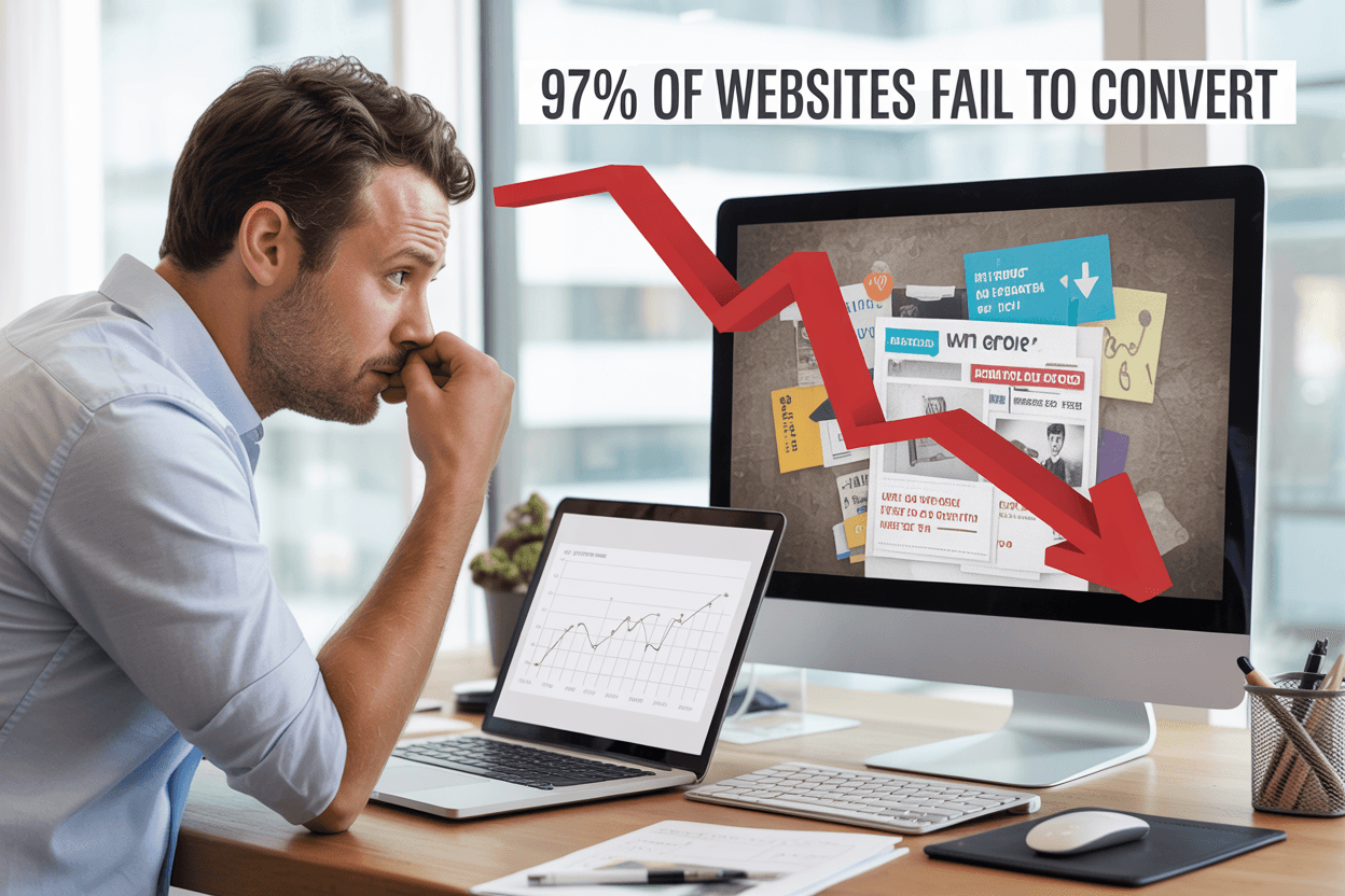
This frustrating reality affects 97% of websites that fail to convert visitors into customers. The problem isn't usually your product or service-it's that your website creates barriers instead of building bridges to conversion.
This guide is for business owners, marketers, and website managers who are tired of watching their traffic analytics climb while their conversion rates stay flat. If you're getting visitors but not getting results, you're dealing with fixable issues that are costing you money every single day.
We'll dig into the specific reasons why websites fail to convert website visitors to customers, starting with technical performance issues that make people click away before they even see your offer. You'll also discover how poor website design conversion problems-from confusing layouts to weak call-to-action strategies-are silently sabotaging your success. Finally, we'll explore how website user experience problems and missing trust signals are destroying the confidence visitors need to become customers.
The good news? Once you identify what's broken, you can fix it and start turning those visitors into the customers you've been working so hard to attract.
Most websites don't convert because they create friction instead of making it easy to trust and take action.
- Technical issues like slow speed, poor mobile experience, and broken links drive visitors away fast.
- Cluttered layouts, generic imagery, and inconsistent branding reduce credibility and focus.
- Weak CTAs and bad placement leave users unsure what to do next.
- Confusing navigation, complex checkout, and hidden key info increase drop offs.
- Missing trust signals and accessibility basics cost conversions and confidence.
Technical Performance Issues That Drive Visitors Away

Slow Loading Times Kill User Patience and Search Rankings
If your site takes longer than three seconds to load, most users will leave before they even see what you're offering. This critical window is where you either capture or lose your potential customers, making website conversion rate optimization heavily dependent on your site's performance speed.
The primary culprits behind slow loading times are bloated images, unnecessary scripts, and cheap hosting solutions. These technical issues don't just frustrate your visitors-they directly impact your ability to convert website visitors to customers. When your pages crawl to load, you're essentially putting up barriers between your audience and your products or services.
Speed optimization should be a top priority for websites serious about improving website conversion rates. Search engines like Google factor page speed into their ranking algorithms, meaning slow sites get buried in search results where potential customers can't find them. This creates a double penalty: reduced visibility and poor user experience for those who do manage to reach your site.
Poor Mobile Responsiveness Loses Over 60% of Your Traffic
Over 60% of web traffic comes from mobile devices, making mobile responsiveness crucial for website conversion optimization. If your site isn't responsive and easy to use on smaller screens, you're missing out on a vast segment of your potential audience and damaging your search engine rankings.
Poor mobile experience doesn't just mean lost traffic-it means lost conversions. When users struggle to navigate your site on their phones or tablets, they abandon their purchase journey and move to competitors with better mobile functionality. This directly impacts your website conversion rate and overall business success.
Mobile-unfriendly websites also face penalties from search engines, which prioritize mobile-first indexing. This means your poor mobile design affects both user experience and your site's ability to be discovered through organic search.
Broken Links and Navigation Errors Create Frustrating Dead Ends
Navigation errors and broken links create frustrating dead ends that immediately derail the user journey. These technical issues signal poor website maintenance and can destroy trust before users even engage with your content or offers.
When visitors encounter broken links, they're forced to backtrack or abandon their exploration of your site entirely. This disruption breaks the flow that should naturally guide them toward conversion actions. Each broken link represents a missed opportunity to convert website visitors to customers.
These technical errors also communicate unprofessionalism and unreliability to your audience. If users can't trust your website to function properly, they're unlikely to trust your business with their money or personal information, creating significant barriers to successful conversions.
Design Elements That Confuse and Overwhelm Users

Cluttered Layouts with Too Many Competing Elements
Your website's layout directly impacts whether visitors stay engaged or abandon their journey toward conversion. When you overwhelm users with too many visual elements competing for attention simultaneously, you create decision paralysis that kills your website conversion rate. Your visitors' eyes don't know where to focus first, leading them to feel frustrated and leave without taking any meaningful action.
Visual hierarchy becomes critical when you're trying to convert website visitors to customers. If your homepage displays multiple banner ads, several call-to-action buttons, numerous product images, social media feeds, and pop-up notifications all at once, you're essentially asking your users to process too much information. This cognitive overload prevents them from identifying the primary action you want them to take.
White space isn't wasted space-it's your conversion optimization tool. When you strategically use empty areas around your key elements, you guide your visitors' attention naturally toward your most important content and conversion points. Your cluttered design forces users to work harder to find what they're seeking, which directly contradicts effective website user experience principles.
Generic Stock Photos That Make Your Brand Feel Impersonal
Your visual content speaks volumes about your brand's authenticity, and generic stock photos undermine your credibility in ways you might not realize. When you use the same staged business photos that appear on hundreds of other websites, you signal to potential customers that your brand lacks originality and genuine connection to its audience.
Your website fails to convert visitors partly because they can't form an emotional connection with your brand through overused imagery. Those generic handshake photos, perfect office scenes, and artificially diverse team shots create distance between you and your prospects. Real customers want to see authentic representations of your actual business, team members, and work environment.
Custom photography investment pays dividends in improved website conversion rates because authenticity builds trust. When you showcase real employees, genuine customer interactions, and actual workspace environments, you demonstrate transparency that resonates with modern consumers who value authenticity over perfection.
Inconsistent Branding Colors and Typography Damage Credibility
Your brand consistency across every page element affects how professional and trustworthy your website appears to potential customers. When you use different fonts, varying color schemes, and inconsistent styling throughout your site, you create subliminal doubt about your business's attention to detail and overall reliability.
Typography inconsistency particularly damages your poor website design conversion because it makes your content harder to read and navigate. If your headings use different font families across pages, your body text varies in size, and your button styles change throughout the user journey, you're creating unnecessary friction that prevents smooth conversion flows.
Your color palette should reinforce your brand identity while supporting your conversion goals. Inconsistent color usage confuses users about which elements are clickable, which information is most important, and what actions they should prioritize. When your call-to-action buttons appear in different colors across various pages, you dilute their effectiveness and reduce the likelihood of successful conversions.
Weak Call-to-Action Strategy That Fails to Guide Users

Missing or Unclear CTA Buttons Leave Visitors Directionless
Your website conversion rate plummets when visitors can't find or understand what action you want them to take next. Without clear, visible call-to-action buttons, you're essentially leaving your potential customers to wander aimlessly through your site, hoping they'll somehow figure out how to engage with your business.
When your CTA buttons blend into your design or use confusing language, visitors experience decision paralysis. They might be interested in your product or service, but if they can't quickly identify how to purchase, sign up, or contact you, they'll abandon your site and likely never return. This lack of clear direction is one of the primary reasons why websites fail to convert visitors into customers.
Your CTA buttons should stand out visually from the rest of your page elements. If they're the same color as your background or use generic text like “Click Here“ or “Submit,“ you're missing critical conversion opportunities. Visitors spend only seconds deciding whether to stay on your site, and unclear CTAs waste precious time they don't have.
Poor CTA Placement That Gets Overlooked by Users
Previously, we've established that unclear CTAs hurt conversions, but even well-designed buttons fail when placed in the wrong locations. Your call-to-action placement directly impacts your website conversion optimization efforts, as visitors follow predictable viewing patterns when scanning web pages.
When you bury your primary CTA below the fold or place it in sidebar areas that users typically ignore, you're significantly reducing your chances of converting website visitors to customers. The most effective CTA placement follows the natural eye movement patterns that users employ when consuming digital content.
Your primary call-to-action should appear above the fold on your homepage and key landing pages, positioned where visitors naturally look first. Additionally, you should include secondary CTAs throughout longer pages, especially after presenting compelling benefits or addressing common objections. This strategic placement ensures that when visitors feel ready to take action, they don't have to search for the next step.
Consider implementing sticky CTAs that remain visible as users scroll, or exit-intent popups that capture visitors before they leave your site. These placement strategies can dramatically improve your website conversion rate by meeting users where they are in their decision-making process.
Vague Action Words That Don't Motivate Immediate Response
With this in mind, next, we'll examine how your choice of CTA text can make or break your conversion efforts. Generic phrases like “Learn More,“ “Get Started,“ or “Submit“ fail to communicate value or create urgency. These weak action words don't motivate visitors to take immediate action because they don't clearly explain what happens next or what benefits the user will receive.
Your CTA copy should be specific, benefit-driven, and action-oriented. Instead of vague phrases, use language that tells visitors exactly what they'll get and when they'll get it. For example, “Download Your Free Guide Now“ is infinitely more compelling than “Submit Form“ because it clearly states the benefit and creates a sense of immediacy.
Strong action words that improve website conversion include “Get,“ “Start,“ “Discover,“ “Unlock,“ “Access,“ and “Claim.“ These verbs suggest immediate benefit and forward momentum. When combined with specific outcomes like “Get My Custom Quote“ or “Start My 30-Day Trial,“ they become powerful conversion tools.
Your CTA text should also reflect your brand voice while maintaining clarity. Whether your tone is professional, casual, or playful, ensure that your call-to-action buttons communicate clear value propositions that compel visitors to take the next step in their customer journey.
Navigation and User Experience Problems

Confusing Site Navigation with Too Many Menu Options
Your website's navigation serves as the roadmap for your visitors, but when you overwhelm them with too many menu options, you're essentially handing them a puzzle instead of a clear path. When users encounter navigation menus with 10, 15, or even 20+ items, they experience decision paralysis – a psychological phenomenon where having too many choices leads to no choice at all.
You might think offering every possible option upfront demonstrates your comprehensive services, but this approach actually hurts your website conversion rate. Research shows that users typically scan navigation menus in less than 3 seconds, and if they can't quickly identify where to go next, they'll leave your site entirely.
The most effective navigation systems follow the “7±2 Rule“ – limiting main menu items to 5-9 options maximum. This doesn't mean hiding important content, but rather organizing it hierarchically through strategic groupings and dropdown menus. Your primary navigation should focus on your visitors' most common goals: learning about your products/services, understanding your value proposition, and taking action.
Complex Checkout Process That Increases Cart Abandonment
Now that we've covered navigation complexity, let's examine how checkout complications devastate your conversion efforts. Your checkout process represents the final hurdle between interest and purchase, yet many websites fail to convert visitors because they've created unnecessarily complex purchasing workflows.
Multi-step checkout processes with excessive form fields, mandatory account creation, limited payment options, and unclear progress indicators all contribute to cart abandonment rates exceeding 70%. Every additional step you require increases the likelihood that your potential customers will abandon their purchase and seek alternatives elsewhere.
You can significantly improve website conversion by streamlining your checkout to essential information only. Implement guest checkout options, display security badges prominently, show clear pricing including taxes and shipping costs upfront, and provide multiple payment methods including digital wallets. Your checkout should feel like a natural conclusion to the buying journey, not an obstacle course.
Poor Information Architecture That Hides Important Content
With this in mind, let's explore how poor information architecture creates website user experience problems that prevent conversions. Your site's information architecture – how you organize, structure, and label your content – directly impacts whether visitors can find what they're seeking and take desired actions.
When you bury important conversion-focused content deep within your site hierarchy or scatter related information across multiple unconnected pages, you're essentially hiding your value proposition from potential customers. Users shouldn't need to hunt through multiple menu levels to find pricing information, product details, contact methods, or testimonials that build trust.
Effective information architecture groups related content logically, creates clear content hierarchies, and ensures your most important conversion elements remain easily accessible from any page. You should audit your site regularly to identify orphaned pages, redundant content, and navigation dead-ends that frustrate users and reduce conversions.
Your content should follow a logical flow that guides visitors from awareness to consideration to action, with clear pathways between related topics and prominent placement of trust signals and social proof throughout the user journey.
Content Mistakes That Destroy Trust and Engagement

Walls of Text That Overwhelm and Bore Visitors
Your website's content density can make or break your conversion rates. When visitors land on your pages and encounter massive blocks of unbroken text, they immediately feel overwhelmed and are likely to bounce within seconds. Research consistently shows that users scan web content rather than read every word, yet many websites still present information in intimidating paragraphs that strain the eyes and test patience.
These walls of text create a psychological barrier between your message and your audience. Your visitors arrive with specific problems they want solved quickly, but dense content forces them to work harder than necessary to find the information they seek. This extra cognitive load drives potential customers away before they can discover your value proposition.
To improve website conversion, you need to break up your content into digestible chunks. Use short paragraphs of no more than three sentences, incorporate bullet points for key benefits, and leverage white space strategically to give your content room to breathe. Headers and subheaders act as guideposts, helping visitors navigate to the sections most relevant to their needs.
AI-Generated Content That Feels Generic and Impersonal
While AI tools can assist with content creation, over-reliance on generic, automated content is destroying your website's ability to convert website visitors to customers. Your audience can instinctively detect when content lacks human insight, personality, and genuine understanding of their specific challenges. This generic feel erodes trust and makes your brand appear disconnected from real customer needs.
AI-generated content often produces technically correct but emotionally flat copy that fails to resonate with your target audience. It misses the nuanced understanding of customer pain points, industry-specific language, and the authentic voice that builds meaningful connections. When your content sounds like it could belong to any company in your industry, you've lost a crucial opportunity to differentiate yourself.
Your website conversion rate suffers when visitors sense they're reading content created by algorithms rather than experts who understand their world. The solution lies in using AI as a starting point while infusing human expertise, personal experiences, and industry insights that only your team can provide. Add specific examples, case studies, and perspectives that reflect your unique understanding of customer challenges.
Missing or Unclear Value Proposition on Your Homepage
Your homepage serves as your digital storefront's front door, yet many websites fail to clearly communicate what they offer and why visitors should care. A weak or missing value proposition is one of the most critical website user experience problems that directly impacts conversion rates. Within the first few seconds of landing on your site, visitors should understand exactly what you do, who you serve, and how you solve their problems.
Poor website design conversion often stems from homepages that focus on company history, generic mission statements, or industry jargon instead of addressing visitor needs. Your value proposition isn't about you – it's about the specific outcomes and benefits your customers will experience. When this message is buried beneath corporate speak or absent entirely, potential customers move on to competitors who communicate their value more clearly.
To improve website conversion optimization, your homepage must immediately answer three fundamental questions: What do you offer? Who is it for? What makes you different? Your value proposition should be prominently displayed above the fold, written in language your customers use, and supported by clear benefits rather than features. This clarity creates the foundation for all other conversion optimization efforts throughout your site.
Trust and Social Proof Deficiencies

Absence of Customer Reviews and Testimonials
Your website's lack of customer reviews and testimonials creates a massive barrier to conversion that you might not even realize exists. When visitors arrive at your site and find no evidence of other customers' positive experiences, they immediately question whether your business is legitimate or worth their trust. This absence of social proof forces potential customers to become the first to take a risk on your product or service, which most people are reluctant to do.
Without testimonials prominently displayed on your key pages, you're missing opportunities to address common objections and showcase real results. Your visitors need to see that others have successfully used your offerings and achieved positive outcomes. When you fail to provide this crucial website trust signals, your website conversion rate suffers significantly as prospects leave to find competitors who demonstrate proven customer satisfaction.
The placement of reviews and testimonials matters just as much as having them. You should strategically position customer feedback near your call-to-action buttons and throughout your sales funnel to reinforce confidence at critical decision points.
Lack of Security Badges and Trust Signals
Your website's absence of security badges and trust signals immediately raises red flags for security-conscious visitors. When potential customers don't see SSL certificates, payment security icons, or industry certifications, they question whether it's safe to share their personal information or make purchases on your site. This lack of visible security measures can destroy your website conversion optimization efforts before visitors even engage with your content.
Modern consumers have become increasingly aware of online security threats, making trust signals essential for conversion. Without displaying badges from recognized security providers, payment processors, or industry associations, your website fails to convert visitors who prioritize safety and legitimacy. These visual indicators serve as instant credibility boosters that can make the difference between a completed transaction and an abandoned cart.
You should prominently display security certifications, privacy policy links, and payment security badges throughout your checkout process and key conversion pages to improve website conversion rates.
Missing Contact Information and Support Options
When your website lacks easily accessible contact information and support options, you create unnecessary friction that prevents visitors from converting. Potential customers need assurance that they can reach you if problems arise, and the absence of clear communication channels suggests poor customer service or even illegitimacy. Your missing contact details force visitors to question whether you'll be available to help them after they make a purchase.
The lack of multiple contact options - such as phone numbers, email addresses, live chat, or support tickets - limits how different types of customers prefer to communicate with businesses. Some visitors need immediate answers through live chat, while others prefer email or phone support. When you don't provide these options, you lose conversions from people who require reassurance or have specific questions before buying.
Your website should feature contact information in the header, footer, and on dedicated contact pages, along with clear support policies and response timeframes to convert website visitors to customers effectively.
Accessibility and Inclusion Oversights

Ignoring Website Accessibility Standards
You're potentially alienating up to 15% of your global audience when you ignore website accessibility standards. This oversight directly impacts your website conversion rate, as visitors with disabilities often abandon sites they can't navigate effectively. When you fail to implement accessibility guidelines, you're not just missing out on conversions – you're also exposing your business to legal risks and reputation damage.
Your website accessibility conversion suffers when you don't follow established standards like the Web Content Accessibility Guidelines (WCAG). These guidelines ensure that people with various abilities can access, navigate, and interact with your content. Without proper accessibility measures, screen readers can't interpret your site correctly, keyboard navigation becomes impossible, and users with motor disabilities struggle to complete actions that convert website visitors to customers.
Poor Color Contrast That Affects Readability
You might not realize it, but poor color contrast is silently destroying your conversion potential. When you use color combinations that don't meet accessibility standards, you make it difficult or impossible for users with visual impairments to read your content. This includes people with color blindness, low vision, or those viewing your site in bright sunlight.
Your website fails to convert visitors when they can't distinguish between your text and background colors. The WCAG recommends a minimum contrast ratio of 4.5:1 for normal text and 3:1 for large text. When you ignore these standards, you force potential customers to strain their eyes or abandon your site entirely. This poor website design conversion killer affects millions of users who might otherwise become paying customers.
Missing Alt Text and Screen Reader Compatibility
You're creating invisible barriers when you neglect alt text for images and fail to optimize for screen readers. These assistive technologies rely on proper markup to convey visual information to users who can't see your images. Without descriptive alt text, your product images, infographics, and visual calls-to-action become meaningless to screen reader users.
Your website conversion optimization efforts are incomplete without proper screen reader compatibility. When you skip alt text, use non-descriptive labels like “image1.jpg,“ or fail to structure your headings properly, you prevent assistive technologies from understanding your content hierarchy. This oversight means users who rely on screen readers can't efficiently navigate to your conversion points, whether that's your contact form, product pages, or checkout process. Making your site compatible with assistive technologies isn't just about compliance – it's about expanding your customer base and improving website conversion for everyone.
Conclusion
Your website's success isn't determined by luck-it's the result of deliberate design choices that either guide visitors toward action or create barriers that drive them away. The seven critical areas we've explored-from technical performance and confusing design elements to weak calls-to-action and missing trust signals-represent the most common reasons why websites fail to convert. Each of these issues is entirely within your control to fix, and addressing them systematically can transform your site from a digital brochure into a powerful conversion machine.
The businesses that succeed online understand that their website isn't just about looking professional-it's about creating an experience that removes friction, builds trust, and makes it effortless for visitors to take the next step. By prioritizing fast loading times, clear navigation, compelling calls-to-action, and strong social proof, you're not just improving your conversion rate-you're reducing the cost of acquiring new customers and maximizing the value of every visitor who finds you. Your website should be your hardest-working sales tool, turning the traffic you're already paying for into measurable business results.
Turn More Visitors Into Customers
If your website is getting traffic but not converting, there are likely a few fixable issues holding it back. We help businesses identify conversion blockers and improve clarity, usability, and trust.
🎁 Free Website Conversion Review
We'll review your layout, messaging, calls to action, navigation, and trust signals, then share a clear action plan you can use right away. No pressure. No sales pitch.