
Upload the wrong dimensions and Facebook will crop your headline, cut off your logo, or squeeze your product photo into an awkward strip. Getting the size for facebook advert right the first time saves you from re-exporting files five times before launch. This matters more than most business owners realize, since a stretched image or a video with black bars on the sides makes even a great offer look unprofessional.
Every placement, feed, Stories, Reels, Marketplace, has its own facebook advert image size requirements, and there is no single dimension that works everywhere. Below you'll find the exact pixel dimensions, aspect ratios, and file size limits for images and video, broken down by placement, so you can build one set of assets that actually fits.
We put this guide together the way we approach every ad campaign for our Orange County clients: practical, specific, and built to get results, not just look nice. Whether you're running your first Facebook Ads campaign or cleaning up a facebook advert banner size that's been rejected or cropped, you'll walk away knowing exactly what to export before you hit publish.
Why the right ad size matters for your results
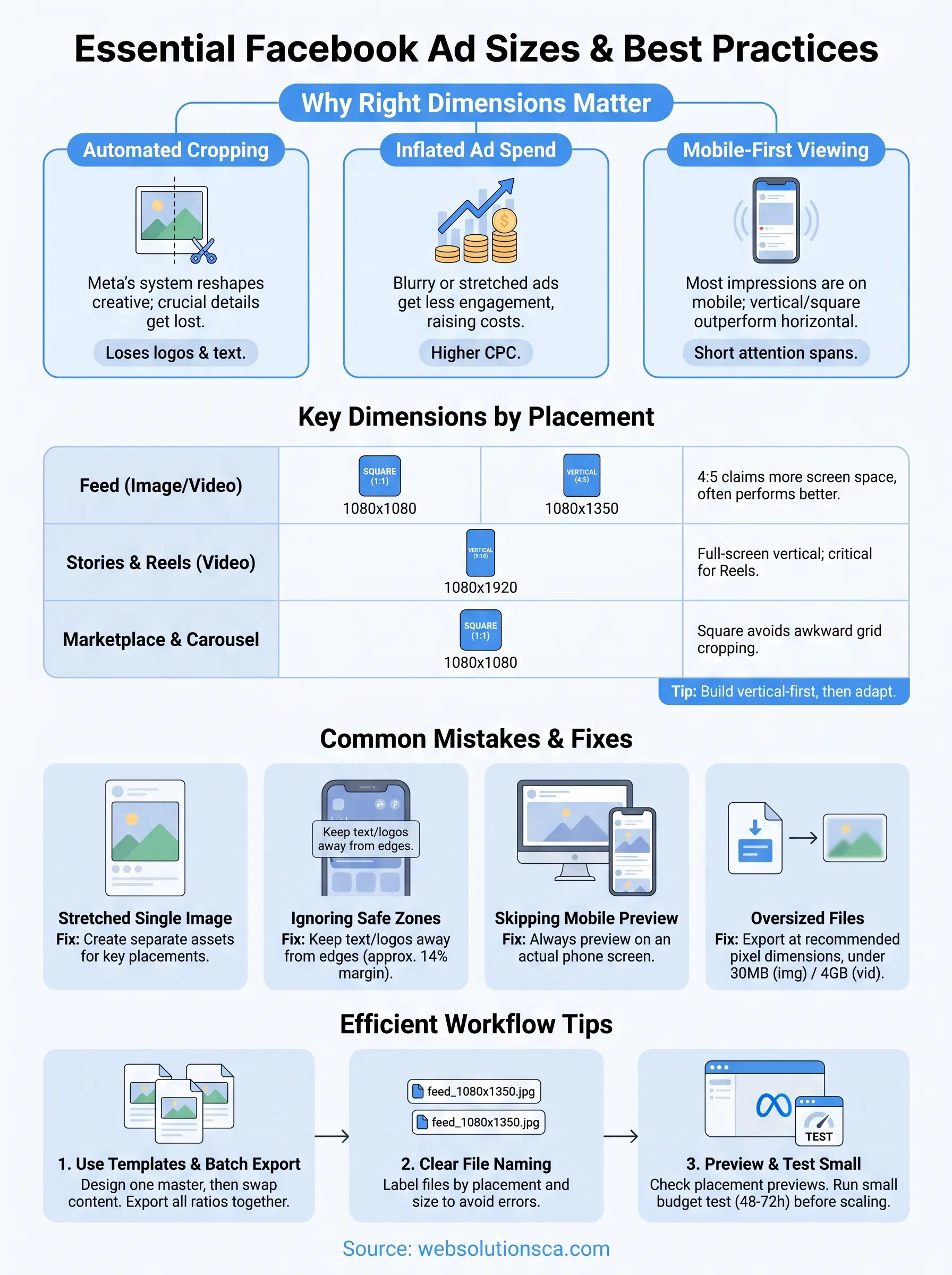
Facebook's ad system doesn't just accept whatever you upload, it reshapes and crops your creative to fit each placement's frame. Get the size for facebook advert wrong, and the platform will stretch a landscape photo into a square, chop off the bottom third of a video, or hide your call-to-action button behind a caption. None of this is intentional sabotage, it's just math: a 1200x628 image forced into a 1:1 feed slot has to lose something, and that something is usually the part of the ad that mattered most.
The algorithm crops before you get a say
Upload an image sized for the wrong aspect ratio and Meta's system will automatically crop it to fit the placement, often without flagging it in the ad preview screen. This is where businesses lose logos, price tags, and phone numbers that sat too close to the edge of the frame. Common consequences of a bad crop include:
- Faces or products cut off mid-frame
- Text overlays pushed outside the safe zone
- Logos clipped from corners
- Captions overlapping key visuals
- Auto-generated black bars on video ads
A cropped ad doesn't just look sloppy, it silently deletes the exact detail that was supposed to sell the click.
Once an ad ships with a bad crop, you usually won't find out until a client mentions it or your click-through rate quietly drops. That's the real cost, not a rejected ad, but a mediocre one that never gets flagged as a problem.
Wrong dimensions inflate your ad spend
Every dollar you spend on Meta Ads competes in an auction, and creative quality is one of the signals that decides how far that dollar goes. Ads with stronger engagement and better relevance scores get cheaper delivery, and blurry, stretched, or oddly cropped images consistently earn less engagement than crisp, correctly sized ones. We've watched clients lower their cost per lead simply by re-exporting a facebook advert picture size that had been squeezed to fit, with nothing else about the campaign changed. If your cost per click has crept up for no clear reason, check your image dimensions before you touch targeting or bid strategy.
Most people see your ad on a phone screen
Nearly all Facebook and Instagram ad impressions happen on mobile devices, according to Meta's own advertising resources, which means vertical and square formats almost always outperform horizontal ones in feed and Stories placements. A facebook video advert size built for widescreen YouTube gets shrunk into a thumbnail-sized strip in a phone feed, losing detail exactly where attention spans are shortest. Designing vertical-first, then adapting down for the rare desktop placement, consistently beats designing horizontal and cropping up.
Getting this right isn't about chasing a technical checkbox, and the same logic applies to every profile you maintain, from your ad creative to your Google Business Profile picture size. It protects the work you already put into your offer, your photography, and your copy so none of it gets lost in translation between your file and the screen.
How to choose the right size for each placement
Meta doesn't ask you to pick one size and move on. It gives you the option to run a single campaign across Feed, Stories, Reels, Marketplace, and the right column all at once, and each of those placements crops your creative differently. The smart approach is to decide upfront which placements actually matter for your goal, then build assets that fit those specific frames instead of hoping one image works everywhere.
Pick your placements before you design, not after your export is already cropped wrong.
Start with your campaign objective
Your objective shapes which placement carries the most weight. A lead generation campaign aimed at local homeowners in Irvine or Tustin usually leans hardest on mobile Feed and Stories, so vertical and square formats deserve your attention first. A retargeting campaign built around video testimonials might rely more on Reels, where a tall 9:16 frame is non-negotiable. Match the facebook advert size to where your audience actually spends time, not to whichever format is easiest to export from your design file.
Use Meta's Advantage+ creative tools
Meta's own Ads Manager lets you upload multiple aspect ratios for a single ad and will automatically serve the version that fits each placement. This is the closest thing to a shortcut here: instead of guessing which crop looks best, you upload a square, a vertical, and a horizontal version, and the system picks the right one per placement. It's not a replacement for designing with safe zones in mind, but it does prevent the worst automatic crops.
Build a short checklist before you export
Before you send anything to production, run through this list:
- Confirm which placements you're actually running (Feed, Stories, Reels, Marketplace, Audience Network)
- Match each placement to its required aspect ratio, not just "close enough"
- Keep text and logos inside the safe zone, away from edges
- Export at the recommended pixel dimensions, not a scaled-down guess
- Preview the ad in Meta's placement preview tool before publishing
Thinking through this list takes ten minutes and saves you from a rejected upload or a silently cropped headline days into a live campaign. Once you know your placements, matching the exact image size for facebook advert specs becomes a formality rather than a guessing game, which is exactly where the next section picks up.
Facebook advert dimensions by placement
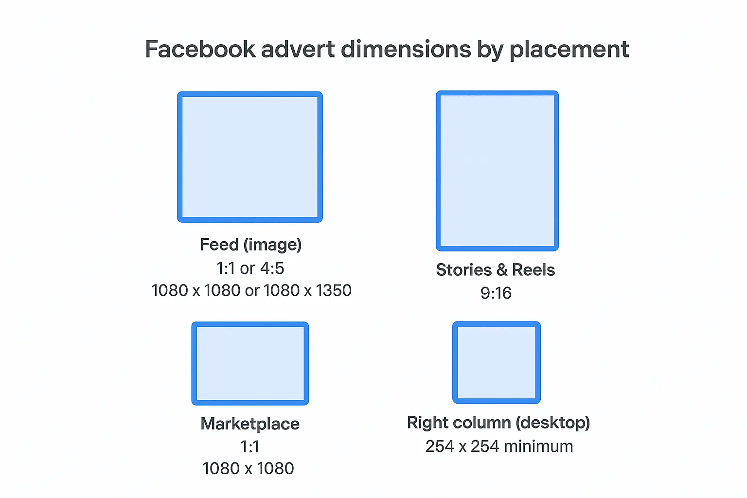
Here's the reference table we send clients before every campaign build. Bookmark it, because these specs change often enough that guessing from memory gets people in trouble. Keep in mind that Meta treats Facebook and Instagram placements as one system, so the same file often runs across both.
| Placement | Recommended Ratio | Pixel Dimensions | Notes |
|---|---|---|---|
| Feed (image) | 1:1 or 4:5 | 1080 x 1080 or 1080 x 1350 | Square performs well, 4:5 fills more mobile screen |
| Feed (video) | 4:5 or 1:1 | 1080 x 1350 or 1080 x 1080 | Keep videos under 240 minutes, but aim for 15-30 seconds |
| Stories & Reels | 9:16 | 1080 x 1920 | Full-screen vertical, this is the facebook video advert size you need for Reels |
| Marketplace | 1:1 | 1080 x 1080 | Square avoids awkward cropping in the listing grid |
| Right column (desktop) | 1:1 | 254 x 254 minimum | Rarely a priority placement, small display area |
| Carousel cards | 1:1 | 1080 x 1080 | Each card follows the same square spec |
For facebook advert post size specs on images, Meta recommends staying under 30MB per file, using JPG or PNG, and keeping text overlay to a minimum since heavy text can limit delivery. Video files should stay under 4GB, run no more than 20% text on any single frame, and export in MP4 or MOV format for cleanest playback across devices.
Why 4:5 beats 1:1 in most feed placements
A 4:5 image claims more vertical real estate in a mobile feed than a perfect square does, which means your product photo or headline sits bigger on screen without any extra cost. We test both formats side by side for most clients, and 4:5 wins on scroll-stopping power often enough that it's become our default recommendation for Feed campaigns.
When two ads cost the same to run, the one that fills more of the screen usually wins the click.
When horizontal still makes sense
Horizontal 16:9 assets aren't obsolete, they just belong in narrower use cases: right column desktop ads, some Audience Network placements, and video content originally produced for YouTube that you're repurposing. If that's the only asset you have, run it, but don't build your primary creative around it. Treat horizontal as the exception you adapt for, not the format you design from first.
Common sizing mistakes that hurt performance
Most sizing problems don't come from ignorance, they come from shortcuts. A business owner grabs whatever photo is on hand, resizes it in a hurry, and uploads it without checking how Meta's crop tool will actually treat it. Here are the mistakes we see most often when we audit a new client's ad account.

Stretching one image across every placement
Using a single facebook advert size for Feed, Stories, and Marketplace is the fastest way to get a mix of good and terrible results from the same creative. A landscape photo built for desktop gets squeezed into a vertical Story and suddenly your product looks two inches wide and eight inches tall. Meta will let you upload it, the platform doesn't reject stretched images, it just delivers them at a disadvantage because engagement drops the moment something looks off.
If one file has to work everywhere, it works well nowhere.
Ignoring the safe zone for text and logos
Text, logos, and calls-to-action placed too close to the edge of the frame get clipped the instant Meta crops for a different placement than the one you designed for. This is especially common with Stories and Reels, where the top and bottom of the frame get covered by profile names, captions, and swipe-up prompts regardless of what your creative shows. Keep a margin of roughly 14% on all sides, and never put critical text in the outer edges of a vertical asset.
Skipping the mobile preview
Designing on a wide desktop monitor tricks you into thinking an image reads clearly, when in reality it shrinks to a few square inches on a phone screen. Small text, thin fonts, and busy backgrounds that looked fine on your monitor become unreadable once compressed into a mobile feed. Always preview on an actual phone before publishing, not just in Ads Manager's desktop preview pane.
Uploading oversized files and waiting for compression
Meta compresses every file you upload, and a bloated facebook advert image size file only makes that compression more aggressive, softening detail and muddying color. Export at the recommended pixel dimensions instead of your largest available file and letting Meta shrink it down, and use an image optimization checklist to keep file weight under control before upload.
- Reusing one flat image across all placements
- Placing text or logos outside the safe zone
- Skipping a mobile preview before launch
- Uploading unnecessarily large files instead of the recommended dimensions
- Ignoring the 20% text rule on video frames
Each of these mistakes is fixable in minutes once you know to look for it, which is exactly why a quick pre-launch review pays off every time.
Quick tips for resizing and testing your creative
Getting the specs right is only half the job. The other half is building a workflow that makes resizing fast instead of painful every time you launch a new campaign. A few small habits save hours of re-exporting and catch problems before they ever reach Ads Manager.
Build a template system instead of resizing from scratch
Create one master template for each core placement (Feed, Stories/Reels, Marketplace) inside whatever design tool you already use, whether that's Canva, Photoshop, or Figma. Drop your logo, headline, and CTA into the safe zone once, then swap the photo or offer text for each new ad instead of rebuilding the layout from zero. This turns what used to be a 30-minute resizing job into a five-minute swap, and it keeps your best size for facebook advert specs consistent across every campaign you run.
Batch your exports and label everything clearly
When you finish a design, export all three aspect ratios (1:1, 4:5, 9:16) in one sitting rather than one at a time as you need them. Name each file with the placement built into the filename, something like springpromo_feed_1080x1350.jpg, so nobody on your team uploads the wrong version by mistake. A simple naming habit like this prevents more launch-day errors than any software feature does.
Preview before you publish, every single time
Meta's Ads Manager includes a placement preview panel that shows exactly how your creative will crop in Feed, Stories, and the right column before you spend a dollar. Use it. Scroll through every placement you've selected and look specifically at the corners and edges, since that's where clipped logos and cut-off text hide. If something looks off in preview, it will look worse live.
If it looks wrong in the preview, it will look wrong to every person who sees it.
Run a small test before scaling spend
Launch new creative at a modest daily budget for 48 to 72 hours before committing your full spend to it. Watch click-through rate and thumb-stop rate in Ads Manager, not just conversions, since a weak creative often shows up in low engagement before it ever shows up in your cost per lead. Swapping a poorly performing image for a correctly sized one mid-campaign is a five-minute fix that regularly turns a mediocre ad into a profitable one.
Getting your specs right before you launch
Getting the size for facebook advert right isn't a technical afterthought, it's part of the offer itself. A perfectly written headline or a great product photo still fails if Meta crops it wrong or a phone screen squeezes it into an unreadable strip. Match your dimensions to each placement, keep text inside the safe zone, and preview everything before you spend a dollar, and you'll avoid the silent performance drain that bad sizing causes.
Running through the specs, checklist, and mistakes above before your next launch will save you real money, not just a cleaner-looking ad. If you'd rather hand this off to people who build and test Facebook and Instagram campaigns every week, see how Web Solutions CA pairs ad management with web design in Orange County, so every dollar you spend reaches the right screen looking sharp and lands on a page built to convert.