You built a landing page, drove traffic to it, and got almost nothing back. No calls, no form fills, just a bounce rate that makes you wince every time you check analytics. That's usually not a traffic problem. When you design landing page layouts without a clear strategy, visitors show up and leave within seconds because nothing tells them what to do next.
A page that converts isn't about flashy design or clever copy alone. It comes down to clear structure, a single focused offer, and removing every distraction that pulls attention away from your call to action. Get those fundamentals right and even a simple page will outperform a beautifully designed one that tries to do too much.
In this guide, we'll walk through the exact elements that separate landing pages that generate leads from ones that just sit there. You'll get practical steps for headlines, layout, forms, and mobile design, based on what we've seen work for small businesses and local service providers across Orange County. By the end, you'll know how to build a page built to turn visitors into calls and customers.
Why landing page design matters for conversions
A visitor decides whether to stay or leave your page in about eight seconds. That's not enough time to read a paragraph, so every second you spend on flashy animations or a wall of text is a second you're losing potential customers. Small businesses often treat a landing page like a mini-website, cramming in a full navigation menu, five different offers, and a blog link. That approach kills conversions because it gives visitors an exit before they've even considered your offer.
The first few seconds decide everything
Google's own research on page experience confirms that speed and clarity directly affect whether people stay on a page or bounce, and that pattern holds true for landing pages just as much as full websites. If your headline doesn't immediately answer "what is this and why should I care," you've already lost a chunk of your traffic. Effective landing page design front-loads the value, so a visitor doesn't have to scroll or think to understand what you're offering and what happens when they click your button.
A landing page has one job: get the visitor to take one action, nothing else.
Landing pages and homepages aren't the same tool
Many business owners send Google Ads or Facebook Ads traffic straight to their homepage, then wonder why conversions are low. A homepage has to serve everyone, new visitors, returning customers, job seekers, and vendors. A landing page exists for a single visitor type with a single intent. Stripping away the navigation bar, footer links, and unrelated service pages keeps attention locked on the one action you want: a call, a form fill, or a booking.
| Element | Homepage | Landing Page |
|---|---|---|
| Navigation menu | Full site menu | Removed or minimal |
| Number of offers | Multiple services | One focused offer |
| Goal | General browsing | Single conversion action |
| Content length | Broad overview | Focused on one message |
| Exit points | Many | Few or none |
The real cost of getting it wrong
Underperforming pages cost more than lost leads. If you're running paid ads, every visitor who bounces without converting is money spent for nothing. A $500 ad budget that sends 200 clicks to a confusing page might generate two leads. The same budget sent to a focused, well-structured page can generate ten or more. That's the difference between a marketing expense and a marketing investment. We've seen Orange County clients cut their cost per lead in half just by rebuilding a cluttered page into a single-purpose one, without spending an extra dollar on ads.
Visitors also form an opinion about your business based on the page itself. A slow-loading, outdated, or confusing landing page signals that your business might be just as disorganized. Trust gets built or broken in seconds, and design is the fastest signal you send. That's why the steps ahead focus on structure and clarity first, decoration second. Once you understand why design drives conversions, the rest of this guide walks through exactly how to build a page that puts these principles into practice, starting with the one step most businesses skip: defining a clear goal before you touch a template.
Step 1. Define your goal and target audience
Before you open a design tool, decide exactly what you want the visitor to do. Skipping this step is why so many businesses design landing page layouts that try to sell three services, collect an email, and book a call all on one screen. A page built around one clear goal is easier to design, easier to write for, and far easier to measure once traffic starts flowing.
Pick one conversion goal
Every landing page needs a single, measurable action. That could be a phone call, a form submission, a booking, or a download. Trying to support more than one goal splits your visitor's attention and usually kills your conversion rate. Common goals we build around for Orange County clients include:
- Phone call: for service businesses like plumbers, dentists, or immigration consultants who close deals over the phone
- Form submission: for quote requests, consultations, or lead capture where follow-up happens later
- Booking or scheduling: for appointment-based businesses like salons or contractors
- Download or signup: for lead magnets, newsletters, or gated resources
Write your goal down in one sentence before moving forward. If you can't state it in a sentence, your visitors won't understand it in eight seconds either.
If you can't name your landing page's one goal in a single sentence, your visitors won't figure it out either.
Know who's actually landing on the page
A landing page written for everyone converts nobody. Target audience clarity shapes your headline, your tone, and even your layout decisions later in this guide. A homeowner searching for emergency window repair needs urgency and a phone number above the fold. A business owner researching tax preparation services needs credibility signals and a clear explanation of what's included before they'll fill out a form.
Build a quick profile before you start designing:
- What problem is this visitor trying to solve right now?
- What did they click on to get here (a specific ad, a search term, a referral)?
- What objection or hesitation is stopping them from converting?
- What would make them trust your business enough to act today?
Match your traffic source to your page. Someone clicking a Google Ad for "same-day AC repair Irvine" expects urgency and a phone number, not a generic services overview. That alignment between ad, headline, and offer is what separates a landing page that converts from one that just looks nice.
Step 2. Choose a platform or template to start from
Once your goal is locked in, you need somewhere to actually build the page. Small business owners often overthink this step, assuming they need custom code or a developer on retainer. In reality, most Orange County businesses get better results faster by starting from a proven template and adjusting it, rather than building from a blank canvas. The platform you pick should match your technical comfort level and how quickly you need the page live, not whatever tool a competitor happens to use.
Match the platform to your technical comfort level
Some platforms favor speed and simplicity, others give you more control at the cost of a steeper learning curve. Before you commit, weigh your options against how much time you actually have to launch.
| Platform | Best for | Setup time | Technical skill needed |
|---|---|---|---|
| WordPress with a page builder | Businesses that already run WordPress or want long-term flexibility | 1-2 days | Moderate |
| Shopify landing page | Ecommerce or product-based offers | Few hours | Low to moderate |
| Dedicated landing page tool | Fast single-purpose pages tied to ad campaigns | Few hours | Low |
| Custom-coded page | Unique branding, complex integrations, or advanced tracking | 1-2 weeks | High (developer needed) |
If you're not sure which route fits, a good rule of thumb: pick the option that gets a functional page live within a week. Speed to launch beats perfection every time, since you can't optimize a page that never goes live.
Choose the platform that gets you live fastest, not the one with the most features you'll never use.
What to look for in a template
Not every template built for a homepage translates well to a conversion-focused landing page. Before you pick one, check that it supports these basics:
- Mobile-responsive layout that adjusts automatically, since most local traffic arrives from phones
- A clean structure that lets you strip out navigation menus and footer links
- Fast loading speed, ideally under three seconds; Google's own PageSpeed Insights tool at pagespeed.web.dev lets you check this before launch
- Built-in form or click-to-call functionality without needing extra plugins
- Easy customization of headline, hero image, and button placement without touching code
A template that checks these boxes gives you a solid foundation. From here, the real work starts: filling that structure with a headline and offer strong enough to make visitors stop scrolling.
Step 3. Craft a headline and offer that hook visitors
Once your platform is ready, the headline is the first thing that determines whether a visitor keeps reading or hits the back button. Most business owners write a headline about their company ("Welcome to ABC Plumbing") instead of one about the visitor's problem. When you design landing page copy, the headline needs to answer one question instantly: what does this visitor get, and why should they care right now?
Write a headline that passes the five-second test
A strong headline names the specific benefit, not the service category. "Licensed Plumber in Irvine" tells visitors what you are. "Same-Day Leak Repair, No Extra Charge on Weekends" tells them what they get. That specificity is what separates a headline that gets skimmed from one that gets read.
- Bad: "Professional Window Installation Services"
- Better: "New Windows Installed in One Day, Free In-Home Quote"
- Bad: "Immigration Consulting You Can Trust"
- Better: "Get Your Green Card Application Reviewed by a Licensed Consultant This Week"
Your headline should tell a stranger exactly what they get in under five seconds, or it isn't doing its job.
Keep your subheadline short and functional. It should remove one objection or add one piece of urgency, like a timeframe, a guarantee, or a price range. Don't try to cram your whole pitch into two lines of text.
Make your offer impossible to refuse
Below the headline sits the offer, the actual reason someone fills out your form or picks up the phone. A vague offer like "Contact us for a quote" gives visitors nothing to act on. A specific offer with a clear benefit and low commitment converts far better, because it reduces the risk of taking the next step.
| Weak offer | Stronger offer |
|---|---|
| Contact us today | Get a free quote in 24 hours |
| Learn more | Download our pricing guide, no email required |
| Schedule a consultation | Book a free 15-minute call this week |
Notice the pattern: each stronger version includes a timeframe, removes friction, or states exactly what happens next. That clarity is what turns a passing glance into a completed action, and it sets up the layout decisions you'll make in the next step.
Step 4. Design the layout for clarity and flow
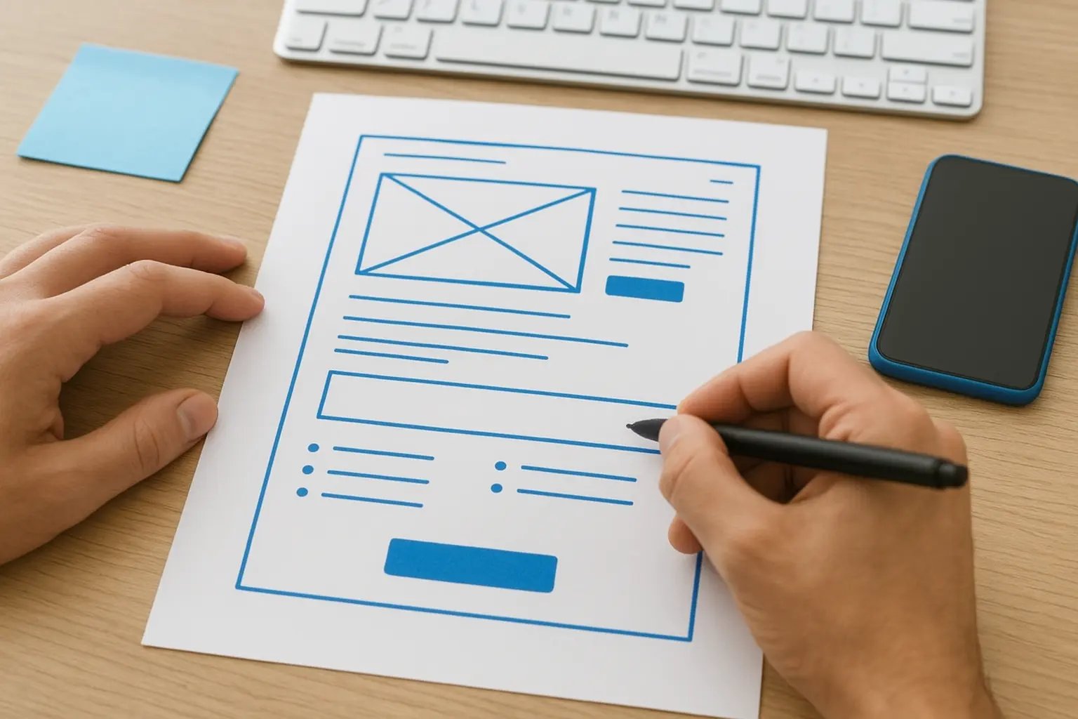
With your headline and offer locked in, the layout decides whether visitors actually see them. A design landing page process that skips layout planning usually ends up with a wall of text or a hero image so large the offer gets pushed below the fold. Good layout guides the eye in a straight line from headline to proof to action, without making the visitor hunt for what to do next.
Build a visual hierarchy that guides the eye
Visitors scan pages in a predictable pattern, usually top to bottom and left to right on desktop, straight down on mobile. Your layout should match that pattern instead of fighting it. Put your headline and hero image at the very top, followed immediately by your offer and a first call-to-action button. Don't bury your value proposition under a slideshow or a video that autoplays before the visitor reads a single word.
A reliable order that works across most industries:
- Headline and subheadline
- Supporting image or short video
- Primary call-to-action button
- Benefit-focused bullet points (three to five, no more)
- Trust signals like reviews or logos
- Secondary call-to-action button near the bottom
If a visitor has to scroll twice before finding your call-to-action button, your layout is working against you.
Cut every element that doesn't earn its space
Each section, image, and paragraph on your page should serve the conversion goal directly. Ask yourself if removing an element would hurt the visitor's understanding of the offer. If the answer is no, cut it. Common offenders include navigation menus, unrelated blog links, multiple competing buttons, and long paragraphs that repeat what the headline already said.
White space matters here too. Cramming everything close together makes a page feel cluttered and harder to read, even on a fast connection. Give your headline, images, and buttons room to breathe, and use consistent spacing between sections so the page feels intentional rather than thrown together.
Design for the thumb, not just the mouse
Most Orange County traffic from Google and Facebook Ads arrives on a phone, so your layout needs to work one-handed. Keep buttons large enough to tap without zooming, stack sections vertically instead of side by side, and place your click-to-call button within easy thumb reach near the top. A layout that only looks good on a desktop monitor is a layout that's losing mobile leads every single day.
Step 5. Add social proof and trust signals
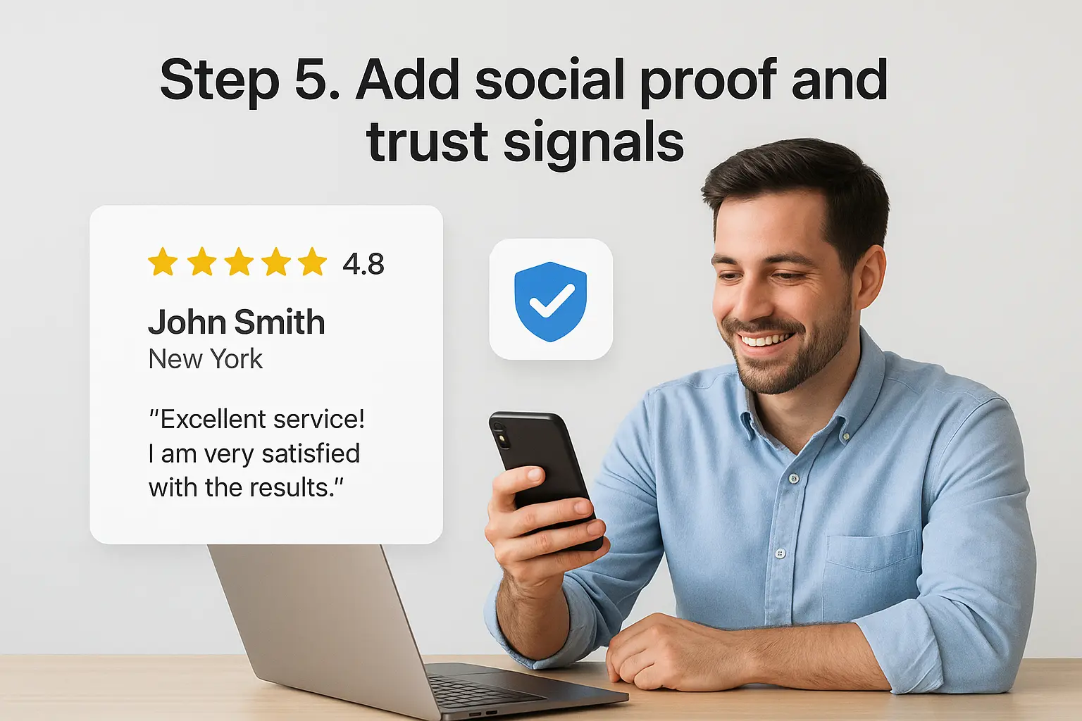
Your layout and offer might be flawless, but strangers still won't hand over their phone number or email without a reason to trust you. Trust signals close that gap. A visitor who sees real reviews, recognizable badges, or a photo of your actual team feels safer clicking your button than one staring at generic stock photography and empty promises.
Show proof, don't just claim it
Telling visitors you're "trusted by hundreds of clients" means nothing without evidence. Specific proof beats vague claims every time, and it doesn't need to be complicated to build. Pull real feedback from Google reviews, past clients, or completed projects, and place it where visitors naturally pause before converting.
- Star ratings: display your Google Business Profile rating near the headline, since it's one of the fastest trust signals a visitor processes
- Client testimonials: use full names, cities, or business names when possible instead of "J.D., Anaheim"
- Before-and-after photos: especially strong for home services, contractors, and anything visually verifiable
- Certifications and licenses: state license numbers and industry certifications build credibility instantly for regulated services like tax prep or immigration consulting
- Media mentions or partner logos: even a small local news feature or association logo adds weight
A single specific testimonial with a name and city does more for conversions than five vague five-star quotes.
Place trust signals where hesitation happens
Timing matters as much as the proof itself. Drop a testimonial or review badge right above your call-to-action button, since that's exactly where visitors pause to decide if they trust you enough to act. A second trust block near the bottom of the page catches visitors who scrolled past your first ask without converting. Avoid dumping every review you've ever collected into one long block, since that just recreates the wall-of-text problem from earlier steps.
Match the proof to the objection
Different visitors hesitate for different reasons, so match your proof accordingly. A homeowner worried about being overcharged responds to pricing transparency and licensing badges. A business owner worried about reliability responds to case studies or a client list. If you're not sure which objection dominates, ask your last five customers why they almost didn't reach out, then build your trust section around that answer. That same understanding of hesitation carries directly into the next step: writing a call to action that finally gets them to click.
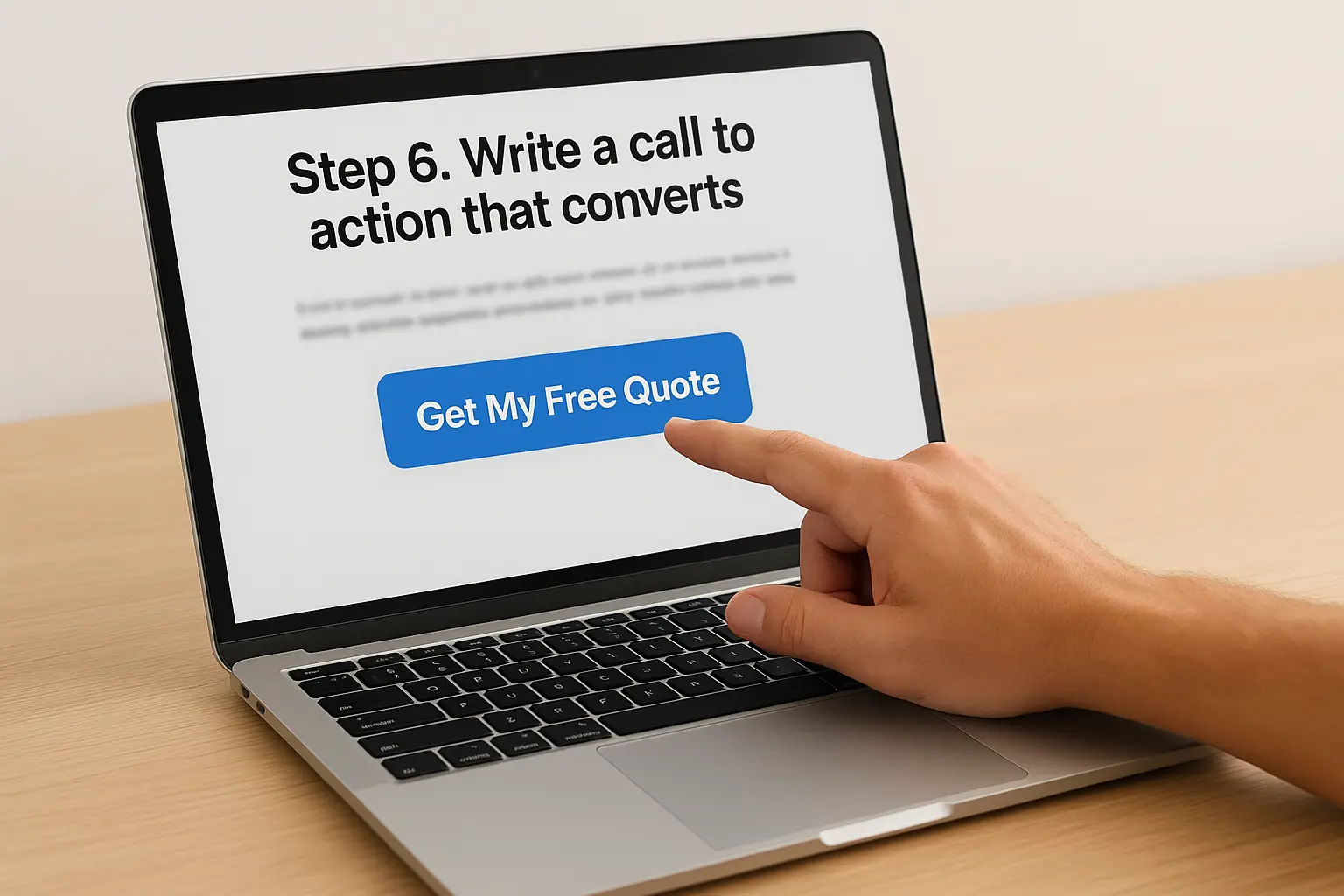
Step 6. Write a call to action that converts
Everything on your page builds toward one moment: the click. Your call to action is where hesitation either turns into action or turns into an exit, and most small business pages waste that moment with a button that just says "Submit" or "Learn More." When you design landing page buttons, treat the copy as the last sentence of your pitch, not an afterthought you slap on after the layout is done.
Ditch generic button text
Generic labels give visitors zero reason to click right now. Specific button copy repeats the benefit and often adds urgency, which pushes hesitant visitors over the edge. Compare these side by side:
| Generic CTA | Converts better |
|---|---|
| Submit | Get My Free Quote |
| Learn More | See Pricing Now |
| Contact Us | Call for Same-Day Service |
| Sign Up | Claim My Spot This Week |
Notice each stronger version uses first-person language ("my") or a timeframe. Both small tweaks make the action feel personal and immediate instead of transactional.
A button that says "Get My Free Quote" will always outperform one that just says "Submit."
Reduce friction at the exact moment of decision
Even a great CTA fails if the action behind it feels like work. Friction reduction is often the single biggest lever you can pull, and it costs nothing to implement. Before you finalize your button, check these:
- Does your form ask for anything beyond name, phone, and the one detail you actually need?
- Is your click-to-call button tappable with one thumb, without zooming?
- Does the button color contrast sharply against the background so it's impossible to miss?
- Have you repeated the CTA at least twice, once near the top and once near the bottom?
- Does the text near the button state exactly what happens next, like "We'll call you within one business hour"?
Repeat your call to action after every major section, not just once at the bottom. Visitors convert at different points depending on how much convincing they needed, so give them a button the moment they're ready, wherever that happens to be on the page. A single well-placed, benefit-driven button will beat a dozen generic ones scattered without purpose, and it sets up the final step: testing whether your assumptions actually hold up with real traffic.
Step 7. Test, optimize, and launch your page
You've built the page, but launching it isn't the finish line. Every assumption you made about your headline, offer, and layout is still just a guess until real visitors interact with it. When you design landing page elements based on gut feeling alone, you leave conversions on the table that a quick test would have caught. Treat launch day as the start of a process, not the end of one.
Check the essentials before you launch
Before you send a single click to the page, run through a pre-launch checklist. Skipping this step is how businesses discover a broken form field three days into a paid ad campaign, after the budget is already spent.
- Test the form and click-to-call button on both desktop and mobile
- Confirm the page loads in under three seconds using PageSpeed Insights
- Check that your headline and offer match the ad or link driving traffic to the page
- Verify analytics and conversion tracking are firing correctly before traffic arrives
- Read every line of copy out loud to catch typos and awkward phrasing
A page that isn't tracked isn't a landing page, it's a guess wearing a URL.
Run a real test before scaling traffic
Once the page is live, resist the urge to rebuild it after one bad day. Split testing needs enough traffic and time to mean anything, usually a couple weeks and at least a few hundred visitors per version. Test one variable at a time, headline, button copy, or hero image, so you know exactly what caused the change in performance.
| What to test | Why it matters |
|---|---|
| Headline wording | Directly affects whether visitors keep reading |
| CTA button text | Small wording shifts often move conversion rate the most |
| Hero image | Changes trust and emotional response instantly |
| Form length | Fewer fields usually means more completions |
Know what to measure after launch
Conversion rate is the number that matters most, but bounce rate and time on page tell you why that number looks the way it does. A high bounce rate paired with a low conversion rate usually points back to a mismatch between your ad and your headline. Ongoing optimization beats a one-time launch every time, since visitor behavior and search trends shift throughout the year.
Turning your landing page into a lead-generating asset
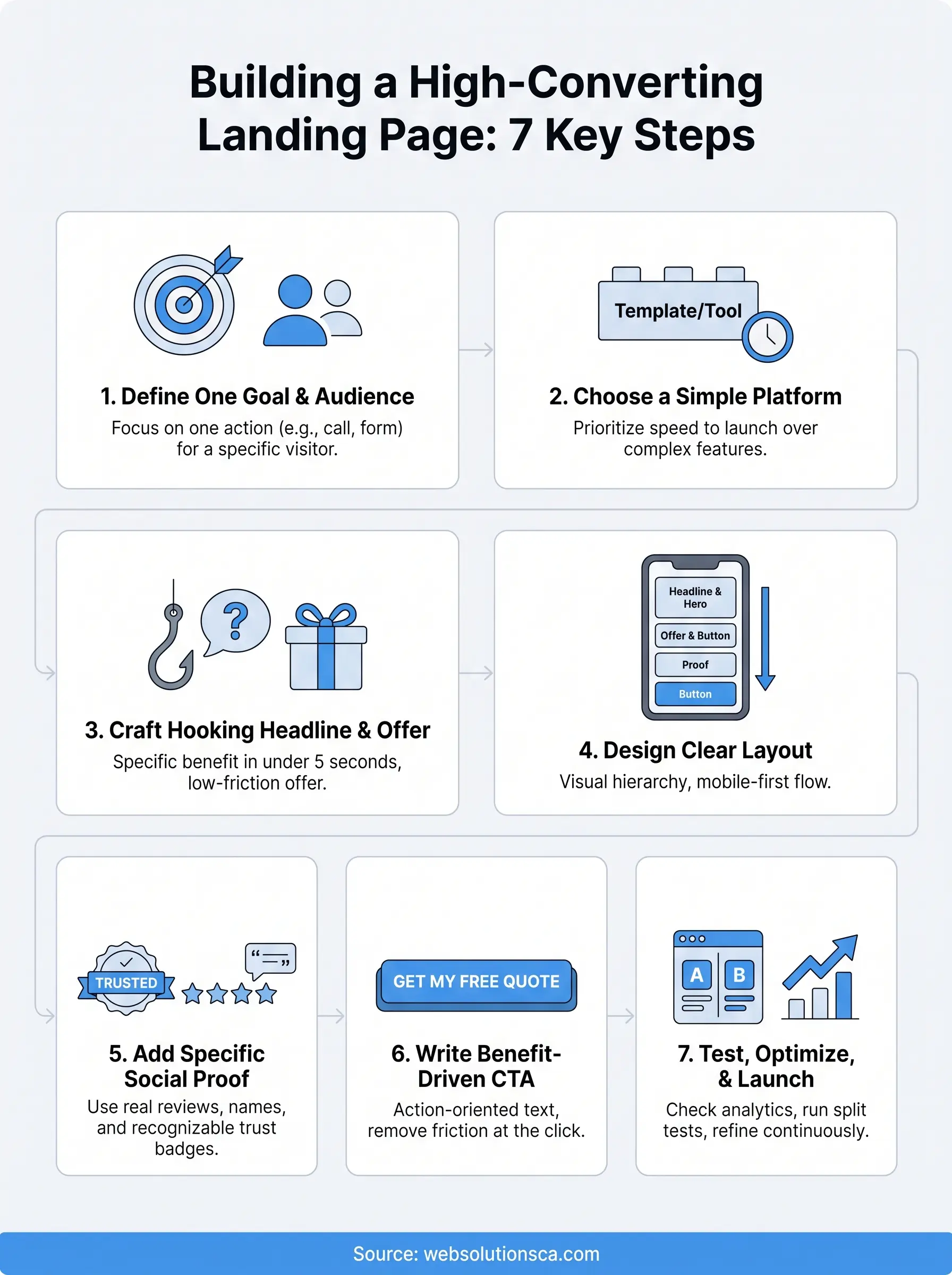
Getting a landing page right isn't about talent or expensive software. It comes down to the sequence you've just walked through: one goal, one audience, a headline that hooks, a layout that flows, proof that builds trust, a CTA that removes friction, and testing that keeps improving results. Skip any one of those steps and you're back to the scenario from the intro: traffic arriving and leaving without converting.
Most small business owners don't have time to build, test, and refine a page while also running the business itself. That's the gap Web Solutions CA fills every day for Orange County clients, combining web design, SEO, and paid ads into one system built around conversions, not just good looks. If you'd rather hand this off to people who design landing page experiences for a living, get a free website consultation and start turning visitors into actual customers.