

A website can look great and still cost you customers. Maybe it loads slowly on a phone, buries your phone number, or never shows up on Google. If you own a small business, you rarely have a designer on staff to tell you which problem you have. You need a way to evaluate website design on your own, with clear criteria and no guesswork.
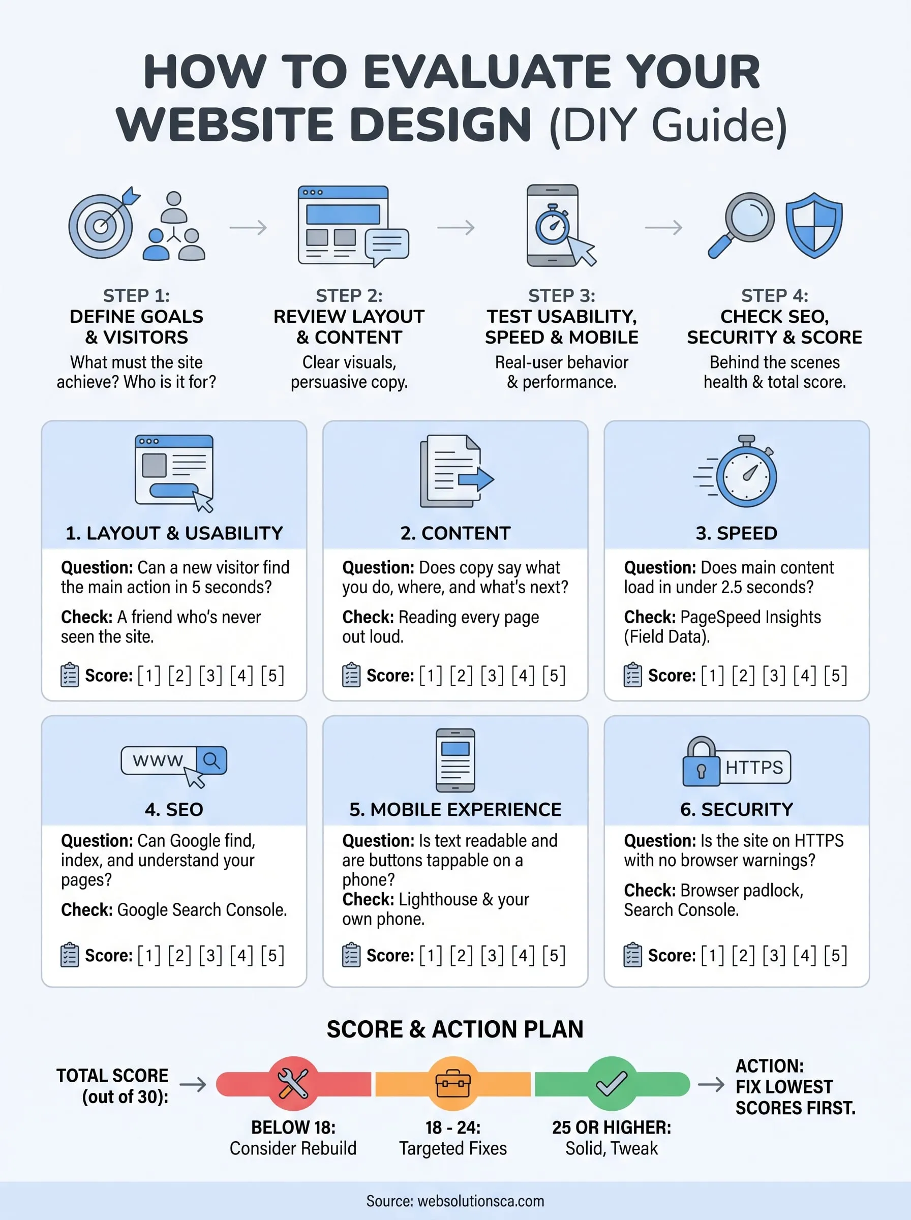
Here is the short answer. Judge your site on six things: layout and usability, content, speed, SEO, mobile experience, and security. Score each one from 1 to 5, then fix the lowest scores first. Most of this takes under an hour, and you can do it with free tools like Google PageSpeed Insights, Google Search Console, and Lighthouse.
Below, we walk through each criterion, what a good result looks like, and which tool to use to check it. We build and audit small business sites across Orange County at Web Solutions CA, so the checks focus on what actually brings in calls and qualified leads, not just what looks polished.
Before you start: what a good evaluation covers
A good evaluation answers one question: does this site help a visitor do what you want them to do? Looks only matter when they support that. To evaluate website design properly, you need to check what visitors see and what runs behind the page, because a polished layout on a slow, insecure site still loses customers.
The six criteria at a glance
Each criterion comes down to one question and one free way to check it. Keep this table open while you work through the next four steps. The tools are all free, and PageSpeed Insights covers speed and mobile in a single run.
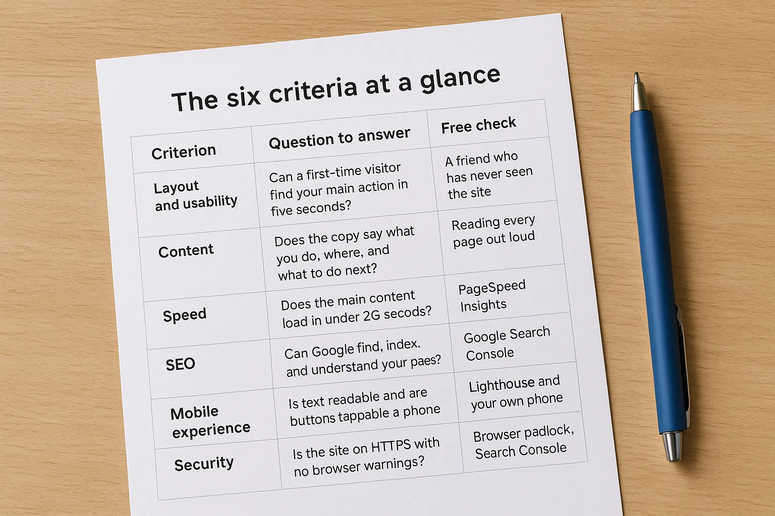
| Criterion | Question to answer | Free check |
|---|---|---|
| Layout and usability | Can a first-time visitor find your main action in five seconds? | A friend who has never seen the site |
| Content | Does the copy say what you do, where, and what to do next? | Reading every page out loud |
| Speed | Does the main content load in under 2.5 seconds? | PageSpeed Insights |
| SEO | Can Google find, index, and understand your pages? | Google Search Console |
| Mobile experience | Is text readable and are buttons tappable on a phone? | Lighthouse and your own phone |
| Security | Is the site on HTTPS with no browser warnings? | Browser padlock, Search Console |
Set up your scoring sheet
Open a spreadsheet before you look at a single page. List the six criteria in rows and give each a score from 1 to 5, with a notes column beside it. A score of 1 means visitors are actively being lost. A 5 means the area works and needs no attention.
Gather these items first so you do not stop halfway:
- Your site's homepage plus your top three pages by traffic or importance
- A phone and a laptop, so you see both layouts
- Access to Google Search Console (free, and you need to verify ownership)
- One person who has never used your site
- About 45 to 60 minutes of uninterrupted time
Scoring forces you to compare problems against each other. Without numbers, every flaw feels urgent, and you end up polishing a logo while the contact form is broken.
A site is well designed when a visitor can reach the action you want in seconds, on any device.
That is the standard behind every step that follows. Write your main goal at the top of the sheet now, because Step 1 turns it into something you can measure.
Step 1. Define your goals and your visitors
Design quality is relative. A site that works for a plumber taking emergency calls fails for a boutique selling online. Before you evaluate website design, decide what the site must achieve and who it must serve. This takes about ten minutes and shapes every score you give in the next steps.
Pick one primary goal
Choose a single action that counts as success. One primary goal keeps your scoring honest, because every page either supports it or gets in its way. Attach a number so you can check progress later. Copy this into the top of your scoring sheet and fill it in:
Primary goal: 20 quote requests per month from the contact form
Secondary goal: 10 phone calls per month from mobile visitors
How I will measure it: Google Analytics, call tracking
If you cannot name the goal, you cannot grade the design.
Describe your visitors
Next, write down who actually visits and what each person wants. Pull real data where you can. Google Analytics shows device type, location, and top pages, which tells you whether most people arrive on a phone or a laptop. Then sketch two or three visitor types:
- A local homeowner on a phone who needs your phone number and service area
- A comparison shopper on a laptop who needs prices, reviews, and proof of past work
- A returning customer who needs hours, a booking link, or a login
Finally, add your goal and visitor types to the top of the sheet. In Step 2, you will judge the layout and copy against them, so a page earns a high score only if it helps these people reach your goal.
Step 2. Review layout, visuals, and content
Now you look at the pages themselves. Open your homepage and your top three pages, then grade them against the goal and visitors from Step 1. This is the part most people think of first when they evaluate website design, but tie the score to whether the page helps visitors act, not to whether it looks modern.
Layout and visuals
Ask a friend who has never seen your site to look at the homepage for five seconds, then close it. Ask what you do and what they would click next. If they hesitate, the layout fails the test. Then check these items:
- One clear primary button above the fold, such as "Get a Free Quote"
- A phone number in the header that you can tap on a phone
- Consistent fonts, colors, and spacing across pages
- Real photos of your team or work instead of generic stock images
- Text contrast of at least 4.5:1, the WCAG minimum for body text
A visitor should know what you do and what to click within five seconds.
Content
Read every page out loud. Awkward sentences, jargon, and vague claims like "quality service" show up fast. Good copy names your service, your city, and the next step. Check that pricing or a price range appears where buyers expect it, and that reviews sit near the call to action. Also hunt for outdated details such as old hours, dead links, and last year's offers.
Finally, give layout and content separate scores from 1 to 5. Write one specific note for each, like "phone number missing in mobile header." Specific notes turn directly into your fix list at the end of this guide.
Step 3. Test usability, speed, and mobile
Screenshots hide most problems. This step checks how the site behaves when a real person uses it. When you evaluate website design this way, you catch the issues that quietly kill conversions, even on a page that looks great.
Run a usability task test
Hand your tester a phone and give them three tasks tied to your Step 1 goal. Watch without helping, and note where they stall:
- Find your phone number
- Request a quote
- Find your service area or hours
If anyone needs more than 30 seconds or three taps, score usability a 3 or lower. Also submit your own contact form, because a broken form loses leads without any warning.
Measure speed
Run your homepage through PageSpeed Insights. Read the field data at the top first, since it reflects real visitors, then compare it to Google's Core Web Vitals targets.
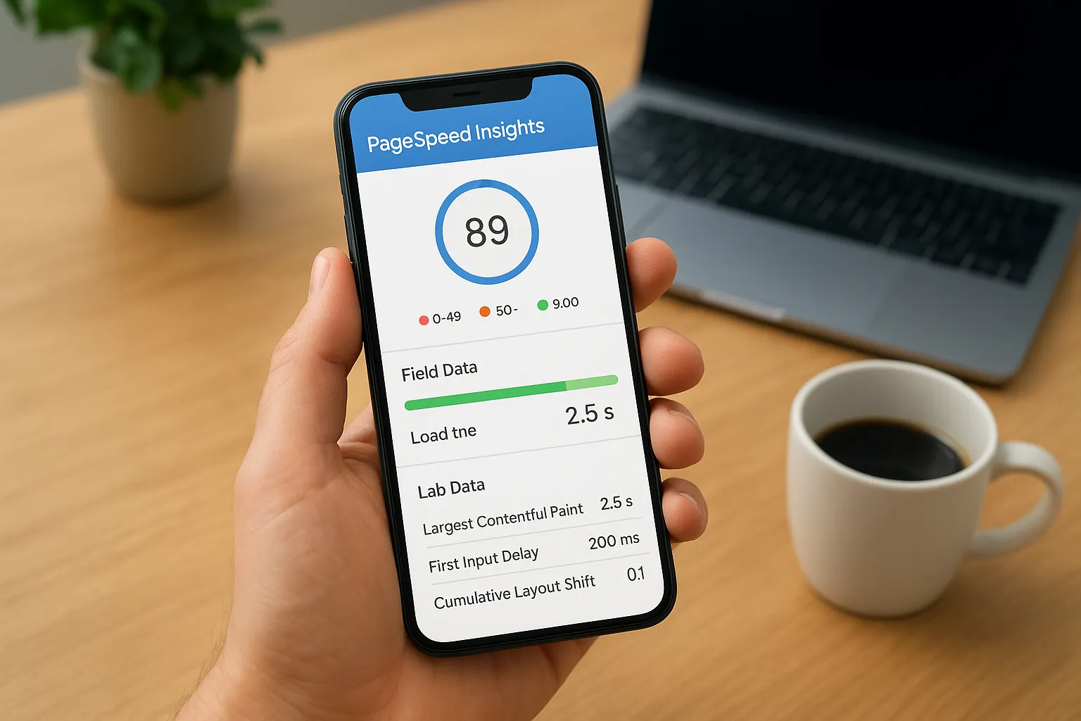
| Metric | What it measures | Good result |
|---|---|---|
| LCP | Main content load time | 2.5 seconds or less |
| INP | Response to taps and clicks | 200 ms or less |
| CLS | Layout jumping while loading | 0.1 or less |
Oversized images are the most common culprit on small business sites. Note the top two recommendations in your sheet.
Check the mobile experience
Open Chrome DevTools with F12, click the Lighthouse tab, and run a mobile report. Then repeat the check on your own phone. Text should be readable without zooming, nothing should scroll sideways, and buttons should be at least 48 pixels tall with space between them.
Test on a real phone, because a desktop window hides what your mobile visitors fight with.
Score usability, speed, and mobile separately, with one specific note each.
Step 4. Check SEO, security, and score with free tools
The last two criteria sit behind the page, so you need tools to see them. Finish the checks below, then total your sheet. This is the step that completes your effort to evaluate website design from every angle.
Check SEO
Open Google Search Console and review the Pages report, which shows which URLs Google indexed. The Performance report shows the searches that bring visitors. Then run the Lighthouse SEO audit (for a deeper check, follow our local SEO audit guide) and confirm each key page has:
- A unique title tag with your service and city
- A meta description that invites the click
- One H1 that matches the page topic
- Alt text on meaningful images
- Your name, address, and phone matching your Google Business Profile
Check security
Look at the address bar first. HTTPS with a padlock is the minimum. Type the http:// version of your address and confirm it redirects to https://.
Next, open the Security issues report in Search Console to catch malware or hacked-content flags. Score security a 1 if any browser shows "Not secure," and update outdated plugins and themes before anything else.
Score with free tools
These three tools cover most of your sheet:
| Tool | What it covers |
|---|---|
| PageSpeed Insights | Speed, mobile, Core Web Vitals |
| Lighthouse | Performance, accessibility, SEO basics |
| Search Console | Indexing, security issues, search queries |
Now add up your six scores. 25 or higher out of 30 means the site is solid and needs tweaks. 18 to 24 means targeted fixes will pay off. Below 18 suggests a rebuild may cost less than patching.
Fix your lowest score first, because it is costing you the most visitors.
Turning your findings into a fix list
Your scoring sheet already holds the fix list. Sort the notes by score, lowest first, and tag each fix as quick, medium, or big. Broken forms, missing phone numbers, and oversized images are usually quick wins you can finish this week. Rebuilds and new content take longer, so put them on a calendar.
To evaluate website design well, you only need a clear goal, six criteria, and free tools. Rerun the same checks in 30 days to see what moved, then repeat every quarter. Sites drift as plugins age and offers change.
Some fixes need a developer, and that is fine. If your total landed below 18, or you would rather hand off the work, Web Solutions CA can take care of the fixes through its web design services in Orange County and tell you plainly what to repair and what to leave alone.