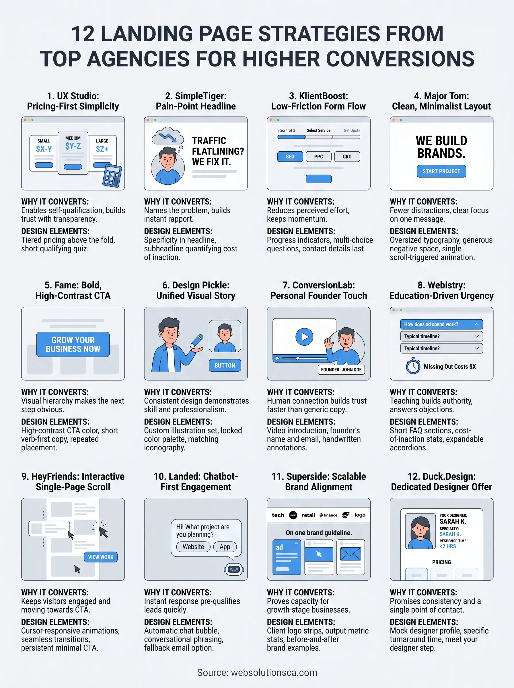
You've probably scrolled through a dozen agency sites this week, trying to figure out why some pages make you pick up the phone while others just sit there looking pretty. If you're building or rebuilding a design agency landing page, the difference usually comes down to a handful of decisions: what headline you lead with, how fast the page loads, and whether the call to action actually asks for something specific.
This list breaks down 12 real examples from landing page design agencies and agency websites that turn visitors into leads, not just page views. You'll see what a strong landing page agency layout looks like in practice, from hero sections to proof elements to forms that don't scare people off.
We work with small businesses across Orange County every day, building sites that need to do more than look good, they need to generate calls and qualified leads. So instead of generic design tips, this roundup focuses on structural choices and conversion elements you can actually borrow, whether you're a landing page development agency yourself or a business owner hiring one.
1. UX Studio's pricing-first simplicity
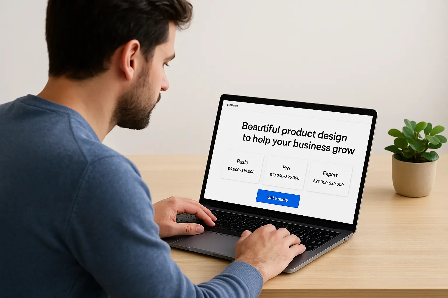
UX Studio, a European UX and product design agency, does something most landing page design agencies avoid: they show pricing ranges right on the homepage instead of hiding behind a "contact us for a quote" button. The page opens with a short value statement, then moves quickly into project tiers with rough cost brackets, so a visitor can self-qualify within seconds instead of filling out a form just to learn if the budget even lines up.
Why it converts
Most people leave an agency site because they can't tell if they can afford the service. UX Studio removes that guesswork early, which cuts down on wasted sales calls for the agency and wasted time for the visitor. This transparency also signals confidence. An agency willing to publish rough numbers looks like it has nothing to hide, and that builds trust faster than a polished testimonial ever could.
Showing even a rough price range does more for trust than any testimonial slider.
Design elements worth stealing
The layout itself is uncluttered, with generous white space and a single accent color used sparingly for buttons and links. A few structural choices stand out:
- Tiered pricing blocks placed above the fold, not buried in a separate page
- A short qualifying quiz (3-4 questions) that routes visitors to the right service before they ever reach a contact form
- Case study thumbnails with one-line outcome statements instead of long paragraphs
- A sticky navigation bar that keeps the "Get a quote" button visible while scrolling
These choices work together because they respect the visitor's time. Nobody has to hunt for information or guess what happens after they click.
Who this style works best for
Small business owners hiring a landing page development agency for the first time tend to respond well to this format because it answers the first question they have, which is cost, without making them ask. It also suits agencies with clearly defined service packages rather than fully custom, quote-only work, since publishing ranges only makes sense when your pricing structure is somewhat standardized.
If your own services vary wildly project to project, a strict pricing table might undersell your flexibility. In that case, a range with a caveat ("most projects fall between X and Y, depending on scope") captures the same trust benefit without locking you into numbers that don't fit every client. Either way, the underlying lesson holds: fewer unknowns on the page means fewer people bouncing before they ever reach your contact form.
2. SimpleTiger's pain-point headline
SimpleTiger, an SEO-focused agency serving SaaS companies, skips the polished mission statement most agencies open with and instead leads with the exact frustration its buyers are already feeling: rankings that won't move, traffic that plateaus, competitors that keep outranking them. The headline reads less like marketing copy and more like something a frustrated founder would type into a search bar at 11 p.m., which is precisely the point.
Why it converts
Naming the reader's problem before pitching a solution builds instant rapport, because it proves the agency actually understands the audience instead of reciting generic promises. Specificity beats polish here. A headline that names the exact frustration outperforms one that just sounds impressive, because it makes the visitor feel understood in the first three seconds rather than sold to.
A headline that names the reader's exact frustration will always outperform one that just sounds impressive.
Design elements worth stealing
Below the headline, the page reinforces the pain point with supporting proof rather than more adjectives:
- A subheadline that quantifies the cost of inaction (lost traffic, lost signups)
- Client logos placed immediately under the fold for quick credibility
- A single, unmistakable CTA button with action-specific copy like "See your growth plan" instead of "Learn more"
These elements keep the visitor's attention on the problem-solution arc without distracting them with secondary offers.
Who this style works best for
This approach suits any landing page agency whose clients arrive already frustrated with a specific, nameable problem, whether that's slow rankings, dated design, or a website that doesn't generate leads. It works less well for broad, general-purpose agencies without a clear niche to speak directly to.
3. KlientBoost's low-friction form flow
KlientBoost, a paid advertising and conversion rate optimization agency, treats the contact form itself as a design problem, not an afterthought bolted onto the bottom of the page. Instead of one long form asking for company size, budget, timeline, and a paragraph about your goals, the page breaks the request into small, low-commitment steps that feel more like a conversation than a job application.
Why it converts
Long forms kill momentum. Every extra field is another chance for a visitor to think twice and close the tab. KlientBoost's multi-step form asks one or two easy questions first, like what service you need, before asking for contact details later in the flow. By the time the visitor reaches the harder questions, they've already invested a few clicks and are less likely to abandon the process.
Every extra form field is a chance for a visitor to change their mind and leave.
Design elements worth stealing
A few specific tactics make this landing page development agency approach work so well:
- Progress indicators so visitors know how many steps remain
- Multiple-choice buttons instead of open text fields wherever possible
- Contact information requested last, after the visitor has already committed mental effort
- A live chat widget as a secondary, lower-commitment option next to the form
Each of these choices lowers the perceived effort of reaching out, which matters more than most agencies assume when they're designing their own landing page agency funnels.
Who this style works best for
This format suits agencies selling services with several distinct offerings, like paid ads, SEO, and design, since the step-by-step questions naturally sort visitors into the right service before a human ever gets involved. It's less useful for single-service agencies where one short form already covers everything you need to know.
4. Major Tom's clean, minimalist layout
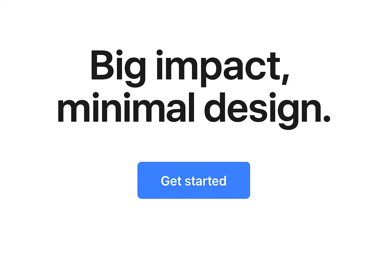
Major Tom, a Denver-based branding and marketing agency, strips its homepage down to almost nothing: one strong statement, generous negative space, and a single scroll-triggered animation that reveals content piece by piece. Where other agencies stack testimonials, service lists, and blog previews above the fold, Major Tom trusts a minimalist layout to do the heavy lifting, betting that restraint reads as confidence rather than emptiness.
Why it converts
Visitors form an opinion about a site in roughly 50 milliseconds, and a cluttered page reads as chaotic before anyone even processes the words on it. Major Tom's approach removes that risk entirely. Fewer competing elements mean the eye has nowhere to go but the headline and the single CTA button, so the message lands before distraction sets in.
A page with one clear message will always beat a page fighting for attention with itself.
Design elements worth stealing
A few specific choices make the minimalism feel intentional instead of unfinished:
- Oversized typography that carries the message without needing supporting graphics
- One accent color reserved entirely for the CTA button
- Scroll-triggered reveals that pace information instead of dumping it all at once
- No sidebar navigation or footer links competing for clicks above the fold
These choices work because every element left on the page had to earn its spot, which is a useful filter for any landing page creation agency auditing its own homepage.
Who this style works best for
This layout suits agencies with a strong, established brand that doesn't need to over-explain itself, along with visitors who already have some familiarity with the agency's work. It works less well for newer agencies still building credibility, since minimalism without proof elements can come across as having little to show.
5. Fame's bold, high-contrast CTA
Fame, a creative agency known for punchy branding work, treats its call-to-action button like a design centerpiece rather than a formality tucked at the bottom of the page. The button sits in a color that clashes on purpose against a muted background, so your eye lands on it whether you're reading the headline or skimming past it. Instead of hedging with soft copy like "Learn more," the CTA reads like a direct invitation: something closer to "Start your project" or "Talk to us now."
Why it converts
High-contrast buttons work because they remove the guesswork of where to click next. Visual hierarchy does the persuading before the copy even gets a chance to. Fame pairs this with confident, short sentences throughout the page, so the bold button doesn't feel out of place next to timid text. When every element points toward one action, visitors don't have to hunt for the next step.
A CTA button only works if it's impossible to miss and impossible to misread.
Design elements worth stealing
A few tactics make this landing page design agency approach repeatable on your own site:
- A CTA color that appears nowhere else on the page, so it never competes with itself
- Short, verb-first button copy over vague phrases
- Repeated CTA placement at natural scroll-stopping points, not just the header and footer
- Ample white space around the button so it never feels crowded
Who this style works best for
This approach suits agencies that already have a bold, distinct brand identity and want their site to feel just as confident as their portfolio. It's a strong fit for creative and branding-focused shops, but service-based agencies with more conservative audiences, like legal or financial clients, may want to soften the contrast slightly to match expectations.
6. Design Pickle's unified visual story
Design Pickle, an unlimited graphic design subscription service, builds its homepage around one consistent visual language instead of stitching together stock photos and mismatched icons. Every illustration, color, and font choice on the page traces back to the same brand system, so scrolling through the site feels like flipping through one cohesive brochure rather than a collection of sections built at different times by different people.
Why it converts
Inconsistency quietly erodes trust even when visitors can't name why. A page that mixes styles signals a team that doesn't sweat details, which is a bad look for a design business specifically. Design Pickle's unified visual system does the opposite: it shows the craft the agency sells before a visitor reads a single word of copy. That's a strong move for any landing page design agency, since the design itself becomes proof of skill.
If you sell design work, your own page is the first sample a client judges.
Design elements worth stealing
A few specific choices keep the page feeling like one connected piece:
- A custom illustration set used consistently across every section instead of stock imagery
- A locked color palette applied to buttons, icons, and section backgrounds alike
- Matching iconography for every service listed, rather than icons pulled from different libraries
- Consistent corner radii and spacing rules across cards, forms, and images
Who this style works best for
This approach fits agencies whose core offer is visual work, since a mismatched page directly undercuts the sales pitch. Startups and service businesses without in-house design talent can still borrow the principle by picking one template and one palette, then applying it everywhere rather than patching pages together over time.
7. ConversionLab's personal founder touch
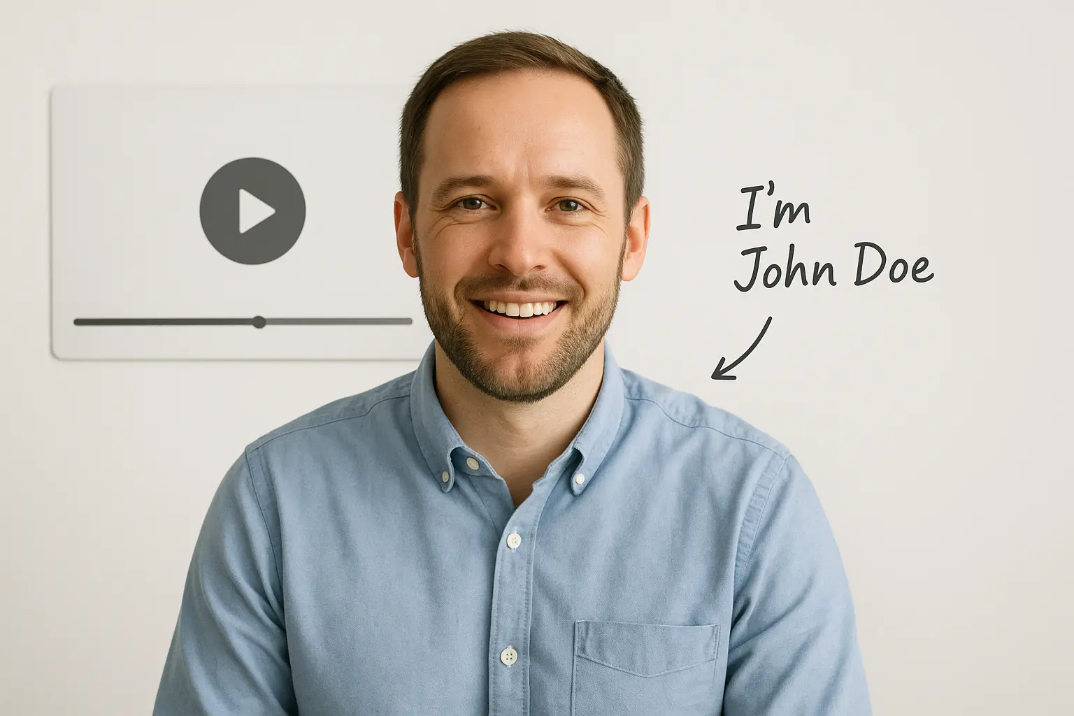
ConversionLab, a conversion-focused landing page agency, puts its founder's face and name front and center instead of hiding behind a faceless "our team" section. A short video greeting plays near the top of the page, where the founder explains who the agency works best with and what a first call actually looks like. There's no stock photo of a smiling stranger in a blazer, just a real person talking directly to the visitor.
Why it converts
People trust people faster than they trust brand names, especially when hiring a small agency instead of a large firm. Founder-led credibility works because it closes the distance between the visitor and the business, replacing polished corporate language with something that feels like an actual conversation. When a visitor can see who they'd be working with before ever booking a call, hesitation drops fast.
A face and a first name build trust faster than any logo wall.
Design elements worth stealing
A few specific choices make the personal touch feel genuine rather than gimmicky:
- A short, unscripted-feeling video introduction placed above the fold
- The founder's name and title next to a direct email, not just a generic contact form
- Handwritten-style annotations pointing to key sections, mimicking a personal walkthrough
- Client testimonials that mention the founder by name, reinforcing the same relationship
Who this style works best for
This approach suits solo consultants and small agencies where the founder is genuinely involved in client work, since the promise has to match reality once the contract's signed. It works less well for larger agencies with dozens of employees, where spotlighting one face might set expectations the rest of the team can't deliver on.
8. Webistry's education-driven urgency
Webistry, a PPC and paid search agency, fills its landing page with short educational snippets instead of a wall of sales copy. Each section answers a question a skeptical buyer would actually ask, like how ad spend gets allocated or what a typical timeline to results looks like, then pairs that answer with a soft nudge that waiting costs money. This landing page agency doesn't pressure visitors with countdown timers or fake scarcity. It builds urgency by showing what inaction actually costs in missed ad performance.
Why it converts
Educated visitors convert at a higher rate because they've already answered their own objections before reaching the contact form. Webistry's approach works because teaching builds authority faster than claiming it. When a page explains the mechanics behind a service instead of just listing benefits, visitors trust that the agency actually knows the work, which matters more in paid advertising than almost any other service category.
Explaining how something works builds more trust than simply promising it works.
Design elements worth stealing
A few structural choices make the education-first format hold attention instead of turning into a lecture:
- Short FAQ-style sections answering objections before the visitor has to ask
- A cost-of-inaction stat placed near the bottom of each educational block
- Expandable accordions so visitors control how deep they go
- A single CTA repeated after each educational section, not just at the end
These choices keep the page informative without losing the thread toward a specific next step.
Who this style works best for
This format suits any landing page development agency selling a service buyers don't fully understand yet, like paid ads, technical SEO, or automation work. It's less necessary for simpler, well-understood services where extensive explanation just slows the visitor down before they act.
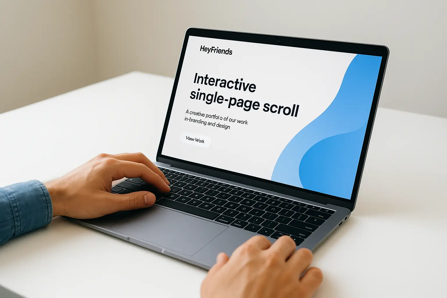
9. HeyFriends' interactive single-page scroll
HeyFriends, a branding and design studio, ditches the typical multi-page agency site and packs everything into one long, interactive scroll. Instead of clicking through separate tabs for services, work, and contact info, visitors move down a single page where each section triggers small animations, hover effects, and playful transitions that respond to cursor movement. It feels closer to a portfolio piece than a corporate brochure, which fits a studio trying to prove its creative range before a single sales pitch happens.
Why it converts
Scrolling keeps visitors moving forward without the friction of a new page load or a confusing menu. Every animation acts as a small reward for continuing down the page, which holds attention longer than a static layout ever could. This matters because engagement time correlates closely with conversion likelihood. The longer someone stays absorbed in a page, the more chances the agency has to plant a specific call to action before the visitor loses interest.
A page that rewards scrolling keeps visitors moving toward the CTA instead of bouncing halfway through.
Design elements worth stealing
A few specific techniques make the scroll experience feel purposeful rather than gimmicky:
- Cursor-responsive animations that react subtly to mouse movement
- Section transitions timed to scroll speed instead of jarring page jumps
- A persistent, minimal CTA button that stays visible without a full navigation bar
- Playful micro-interactions on buttons and images that hint at the studio's design skill
Who this style works best for
This format suits creative studios and any landing page creation agency that wants the page itself to double as a portfolio sample. It's a poor fit for service-heavy agencies whose visitors want quick answers, since heavy animation can slow load times and frustrate people in a hurry.
10. Landed's chatbot-first engagement
Landed, a design and development agency, replaces the standard contact form with a conversational chatbot that greets visitors the moment the page loads. Rather than asking someone to fill out fields and wait days for a reply, the bot asks a few quick questions about project type and budget, then routes the conversation toward booking a call or leaving contact details. It reads less like a support widget bolted onto the corner of the screen and more like the actual front door of the business.
Why it converts
Waiting kills momentum, and a chatbot answers that problem by responding the instant someone shows interest. Instant response matters most in the first sixty seconds after a visitor lands, before distractions pull their attention elsewhere. Landed's bot also asks lighter, friendlier questions than a typical form, which keeps the interaction feeling like a quick chat instead of paperwork.
The agency that responds first usually wins the client, and a chatbot responds before anyone else gets the chance.
Design elements worth stealing
A few specific choices make this landing page agency tactic work without feeling robotic:
- A chat bubble that opens automatically after a short delay, not on page load
- Conversational, informal question phrasing instead of form-style labels
- A fallback option to leave an email if the visitor doesn't want to chat live
- Chat history saved so a human can pick up the conversation seamlessly later
Who this style works best for
This approach suits agencies fielding a steady stream of similar, straightforward inquiries where a bot can pre-qualify leads before a human joins in. It's a weaker fit for agencies handling complex, highly custom projects, where visitors expect a real conversation from the very first exchange rather than a scripted flow.
11. Superside's scalable brand alignment
Superside, a design-as-a-service company built for scaling companies like Shopify and Amazon, structures its landing page around one core promise: consistent brand output no matter how many requests come in at once. The page walks through how a dedicated team plugs into a client's existing brand guidelines, then delivers everything from social graphics to full campaigns without the quality dipping as volume increases. It's less about a single project and more about proving this landing page agency can act as an extension of an in-house team.
Why it converts
Companies outgrow small agencies the moment their output needs jump, and Superside's page speaks directly to that fear. Scalability messaging works because it answers a question growth-stage buyers ask before anyone else does: what happens when we need ten times the work next quarter? By showing real client logos alongside specific output numbers, the page proves capacity instead of just claiming it.
Buyers scaling fast care less about your best project and more about your worst-case turnaround.
Design elements worth stealing
A few specific choices reinforce the scale-focused pitch:
- Client logo strips grouped by industry to show range across different brand styles
- Output metrics (turnaround time, volume capacity) displayed as simple stats, not buried in paragraphs
- Side-by-side before-and-after brand examples showing consistency across formats
- A dedicated "how it works" section explaining the workflow, not just the results
Who this style works best for
This approach suits any landing page development agency targeting mid-size to large companies with recurring design needs rather than one-off projects. It's overkill for agencies serving small local businesses that just need a single site or campaign, since scalability claims mean little to a buyer who only has one project in mind.
12. Duck.Design's dedicated designer offer
Duck.Design, a subscription-based design agency, sells one thing above everything else: a single dedicated designer assigned to your account instead of a rotating pool of freelancers. The landing page leads with this promise directly, showing a mock profile card of "your designer" complete with a photo, specialty, and response time, before the visitor even scrolls to pricing or portfolio work. It's a landing page agency pitch built entirely around continuity, which is exactly what buyers burned by inconsistent freelance work are looking for.
Why it converts
Most people hiring outside design help have already dealt with the headache of explaining brand guidelines to a new freelancer every few weeks. Duck.Design's page speaks straight to that fatigue by promising one consistent point of contact for the life of the subscription. Naming that specific pain point, rather than just listing services, makes the offer feel tailored instead of generic.
People don't want another vendor, they want one person who already knows their brand.
Design elements worth stealing
A few structural choices make the dedicated-designer promise land:
- A mock designer profile shown before any pricing details
- Turnaround time listed as a specific number of hours, not a vague range
- A "meet your designer" step built into the onboarding flow shown on the page
- Subscription tiers compared side by side in a simple table format
Who this style works best for
This approach suits any landing page design agency running a subscription or retainer model, where continuity is the actual product being sold. It works less well for project-based shops where a single point of contact isn't part of the deal anyway, since promising something you can't structurally deliver undercuts trust fast.
Putting these ideas into your own landing page
None of these 12 examples work because of one clever trick. They work because each agency picked a specific problem, whether that's pricing confusion, slow response times, or generic messaging, and built the entire page around fixing it. That's the real takeaway for your own design agency landing page: pick one or two structural changes from this list, whether it's a shorter form, a bolder CTA, or a headline that names your visitor's actual frustration, and test them before overhauling everything at once.
You don't need a full redesign to start converting better. Small, deliberate changes usually beat a from-scratch rebuild anyway. If you'd rather skip the trial and error, talk to our team at Web Solutions CA and we'll build a landing page around what actually gets Orange County businesses more calls and qualified leads, not just more traffic.