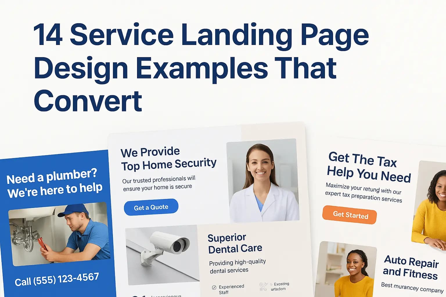
You've got a service business and a landing page that just sits there. No calls, no form fills, just traffic that bounces after five seconds. That's usually a design problem, not a marketing problem. Most service landing page design mistakes come down to the same handful of issues: weak headlines, buried contact info, and layouts that make visitors work too hard to figure out what you're offering.
This article shows you 14 real examples of landing pages built specifically for service businesses, the kind that turn visitors into qualified leads instead of just page views. You'll see what separates a page that converts from one that quietly loses you customers every day, from headline structure and trust signals to call-to-action placement and mobile layout choices.
We build these pages for a living at Web Solutions CA, mostly for small businesses and local service providers across Orange County, so these picks aren't random inspiration pulled from a design blog. Each example includes what works, why it works, and how you can apply the same conversion principles to your own site, whether you're starting from scratch or fixing a page that's underperforming right now.
1. Web Solutions CA custom landing pages for local businesses
We start with our own work because it's the model every other example on this list borrows from. Web Solutions CA builds custom landing pages for small businesses across Costa Mesa, Irvine, Santa Ana, and the rest of Orange County, and the goal is always the same: turn a visitor into a call, form fill, or booked appointment within the first scroll. These aren't stock templates with a logo swapped in. Every page starts with a conversation about the business, its customers, and what a qualified lead actually looks like for that specific owner.
Design highlights
Our pages follow a tight structure that removes guesswork for the visitor. A service-specific headline sits above the fold, paired with a phone number and a single clear call-to-action button, no navigation menu pulling attention away. Below that, we stack trust elements (reviews, licenses, before-and-after photos) in the order that matters most to that industry. A window and door contractor needs project photos high on the page. A tax preparer needs credentials and security badges instead.
- Above-the-fold headline tied to the exact service searched for
- Click-to-call button visible on mobile without scrolling
- Trust signals (reviews, certifications, guarantees) placed within the first two scrolls
- Short form with 3-5 fields max, never a 12-field intake form
- Fast load times, typically under two seconds on mobile connections
Why it converts
Speed and clarity do the heavy lifting here. Google's own research on page experience shows that conversion rates drop sharply as load time increases, which is why we optimize images, scripts, and hosting before touching a single design element (see Google's page experience guidance). We also test mobile responsiveness on real devices, not just browser previews, because most of our clients' traffic comes from someone searching on their phone while standing in their driveway or kitchen.
A landing page only converts if it loads fast, states the offer clearly, and gives the visitor one obvious next step.
Beyond speed, the pages are built around conversion tracking from day one. Every button click, form submission, and phone call gets tagged so the business owner knows which pages and campaigns are actually producing leads, not just traffic.
Best for
These custom builds suit small business owners who've tried a generic template or DIY site builder and gotten little to show for it. If you're a local service provider in Orange County who wants a page built around your actual customers rather than a one-size-fits-all layout, this approach fits. It also works well for businesses running paid ads, since a dedicated landing page tied to a specific campaign consistently outperforms sending traffic to a generic homepage.
2. Home services contractor landing page design
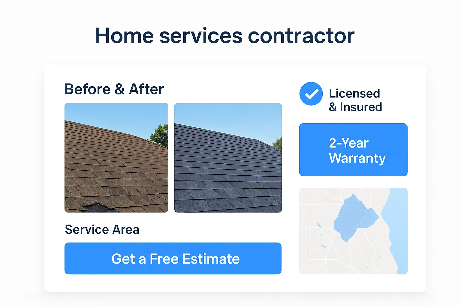
Contractors selling roofing, plumbing, HVAC, or window and door installation deal with one big obstacle: visitors comparing three or four companies before ever picking up the phone. A strong contractor landing page design has to prove competence fast, usually through photos of finished work and a clear service area, before the visitor moves to the next tab.
Design highlights
Good contractor pages lean on visual proof over long paragraphs of copy. Project galleries sit near the top, followed by a licensing badge and a warranty or guarantee statement that removes risk from the decision.
- Before-and-after photo galleries above the fold or just below the headline
- License, insurance, and warranty information visible without scrolling far
- Service area map or list of cities covered
- Financing or free-estimate offer built into the primary call-to-action
Why it converts
Homeowners hiring a contractor are usually dealing with an urgent problem, a leaking roof or a broken furnace, so fast contact options matter more than clever copywriting. Pages that put a click-to-call button and a request-an-estimate form within the first screen consistently outperform ones that bury contact details in a footer.
Contractors win the click when the page proves the work before the visitor even fills out the form.
Social proof does the rest of the convincing. A rotating set of five-star reviews next to the photo gallery reassures a visitor who's never heard of your company before, which matters a lot in a home services landing page built for a specific neighborhood or zip code.
Best for
This layout fits roofers, plumbers, electricians, HVAC companies, and window and door installers who rely on local search traffic and paid ads targeting a specific service area. It's especially effective for businesses running Google Ads campaigns, since matching the ad's promise to the landing page's visuals keeps cost-per-lead lower.
3. Dental and healthcare practice landing page design
Patients researching a new dentist or healthcare provider want reassurance before they ever pick up the phone, which makes a calm, trustworthy healthcare landing page design different from the urgency-driven pages contractors use. The goal here isn't speed to conversion so much as removing anxiety, since most visitors are choosing a provider they'll see repeatedly, not a one-time fix.
Design highlights
Clean layouts with plenty of white space, soft colors, and real photos of the office and staff work better than stock imagery in this space. Patients want to see who they're trusting with their care before they book anything.
- Staff and doctor photos with credentials listed clearly, not buried in a bio page
- Online booking widget or scheduling link placed above the fold
- Insurance accepted and payment options spelled out early
- Patient testimonials focused on comfort, wait times, and bedside manner
Why it converts
Dental and medical practices compete on trust more than price, so pages that answer "will this be a good experience" outperform ones that just list services. Showing a real photo of the waiting room or a short video of the doctor introducing themselves does more work than a paragraph of credentials ever could.
Healthcare pages convert when they answer the patient's unspoken question: will I feel comfortable here.
Booking friction kills conversions in this industry more than almost any other. A page that requires a phone call during business hours loses patients who are browsing at 9pm, so an embedded scheduling tool or a simple form that promises a callback within the hour keeps that visitor from clicking away to a competitor's site instead.
Best for
This structure fits general dentists, orthodontists, chiropractors, physical therapists, and small medical or dental practices trying to grow their patient base through local SEO and Google Business Profile traffic. It works especially well for practices accepting new patients who need the page to build trust quickly with someone who has zero history with the office.
4. Immigration and legal services landing page design
Someone searching for an immigration attorney or legal service is often dealing with a stressful, time-sensitive situation, sometimes in a language other than English. A well-built legal services landing page has to communicate credibility and calm within seconds, since visitors in this space are especially wary of scams and unqualified help.
Design highlights
Clarity beats cleverness here. The page needs to state exactly what type of case the attorney handles, in plain language, without legal jargon that confuses someone who's already anxious about their situation.
- Language toggle or bilingual copy for practices serving Spanish-speaking or other non-English-speaking clients
- Case type clearly named (family-based visas, deportation defense, green cards) instead of vague "immigration law" labels
- Free consultation offer with a simple form or click-to-call button above the fold
- Attorney photo and bar credentials visible near the top of the page
Why it converts
Trust drives every decision in this niche, so pages that lead with results, like case outcomes or years handling a specific visa type, perform better than ones that just list general services. Visitors want proof the attorney has handled a situation like theirs before, not a generic list of practice areas copied from a template.
Legal pages convert when the visitor immediately recognizes their own situation in the headline.
Response speed matters just as much as design. Immigration and legal matters often come with deadlines, so a form that promises a callback within a set timeframe, paired with a phone number that's actually answered, keeps a worried visitor from calling three other firms while they wait.
Best for
This approach suits immigration consultants, family law attorneys, and document preparation services targeting local search traffic in a specific city or county. It works particularly well for practices serving immigrant communities where bilingual messaging and a document preparation landing page built around specific forms or visa categories outperform a general law firm homepage.
5. Tax preparation and accounting landing page design
Tax season creates a narrow window where a business either captures a client or loses them to the next search result. A tax preparation landing page has to move fast, because someone searching for help with a filing deadline isn't browsing for inspiration. They want to know you can handle their situation and get started today.
Design highlights
Credibility markers matter more than pretty visuals in this niche. Visitors want proof you're qualified to handle their money before they hand over sensitive documents, so the page needs to establish that trust in the first few seconds.
- Credentials (CPA, EA, IRS-authorized e-file provider) displayed near the headline
- Secure document upload link or portal mentioned early, not buried in a footer
- Pricing transparency, even if it's a starting price or free consultation offer
- Deadline-specific messaging during tax season ("file by April 15")
Why it converts
Specificity beats generic promises here. A page that names exact services, self-employed filings, small business bookkeeping, back taxes, outperforms one that just says "tax help for everyone." Visitors self-select faster when they see their exact situation named on the page instead of guessing whether you handle it.
A tax page converts when the visitor can tell within five seconds that you handle their exact situation.
Security signals also carry real weight. Since clients are sharing Social Security numbers and financial records, a visible mention of encrypted uploads or data protection standards reduces hesitation that a generic contact form can't overcome on its own.
Best for
This structure suits solo CPAs, small accounting firms, and tax preparation services competing for local search traffic during filing season. It's also effective for bookkeeping businesses trying to convert seasonal tax clients into year-round accounting relationships, since a page built around trust and specific services tends to keep working long after April.
6. Real estate agent landing page design
Buyers and sellers browsing listings expect polish, so a real estate landing page has to look as good as the homes it's promoting. Agents competing for a specific zip code or neighborhood need a page that positions them as the local expert, not just another name on a brokerage roster. Since real estate decisions involve serious money, visitors also want proof of recent activity, not a bio page that hasn't been updated since a license renewal.
Design highlights
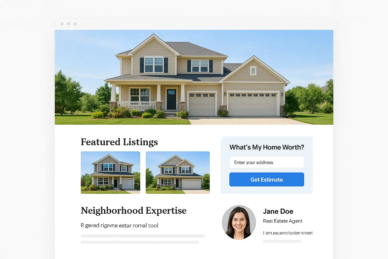
Visual quality drives everything in this niche. High-resolution photos, a clean IDX search widget, and a simple lead capture form work better than a cluttered page trying to do too much at once.
- Featured listings or recent sales displayed prominently near the top
- Home valuation tool or "what's my home worth" form as the primary call-to-action
- Neighborhood expertise highlighted through local market stats or a short area guide
- Agent photo and a short, specific bio instead of a generic brokerage template
Why it converts
Sellers convert when they see proof an agent knows their specific street or school district, not just the city in general. A home valuation tool works especially well because it gives visitors something immediate in exchange for their contact information, rather than asking them to commit to a phone call cold.
Real estate pages convert when the visitor believes the agent already knows their neighborhood better than they do.
Buyers respond differently, favoring listings and search tools over lead forms, so pages built for buyer traffic need an easy way to browse homes without forcing a signup first.
Best for
This layout suits solo agents and small teams targeting a specific Orange County neighborhood through local SEO and paid search, especially those competing against larger brokerage sites with generic templates.
7. Home security company landing page design
Fear of break-ins or package theft drives most searches for a home security provider, so a home security landing page needs to balance urgency with reassurance instead of leaning on scare tactics alone. Visitors want to know the system actually works and that installation won't turn into a hassle, so the page has to answer both questions before asking for a phone number or email.
Design highlights
Clean, modern visuals work better than dark, ominous imagery in this niche, since the goal is confidence, not additional anxiety. A short video walkthrough of the app or camera feed often does more to close the sale than a paragraph of specs.
- Free quote or no-contract offer as the primary call-to-action
- App screenshots or a short demo video showing the monitoring dashboard
- Response time guarantees for alarm monitoring stated clearly
- Package comparison table (cameras, sensors, monitoring tiers) instead of one bundled price
Why it converts
Transparency about contracts and pricing removes a common objection in this industry, since many visitors have been burned before by long-term agreements they didn't fully understand. A page that spells out monthly cost, equipment included, and cancellation terms upfront earns more trust than one that hides pricing behind a "call for quote" button.
Security pages convert when the visitor trusts the system as much as they fear the problem it solves.
Urgency still plays a role, but it works better paired with proof. Showing real response times or a local monitoring center address reassures a visitor who's comparing five different home security landing page offers in the same browsing session.
Best for
This approach fits local and regional alarm companies, smart-home installers, and camera system resellers competing against national brands with bigger ad budgets. It works especially well for businesses running paid search campaigns targeting homeowners after a nearby break-in gets local news coverage.
8. Moving and relocation services landing page design
Moving is stressful, and most people booking a mover are juggling a deadline, a budget, and a healthy fear of hidden fees. A well-designed moving company landing page needs to cut through that stress with an instant quote tool and pricing that doesn't feel like a trap. Visitors comparing three or four moving companies in the same afternoon will pick whichever page makes getting a number the easiest.
Design highlights
Quote tools do the heavy lifting on these pages, so the form needs to sit front and center instead of competing with unrelated content. Distance, home size, and moving date fields keep the estimate specific enough to feel trustworthy.
- Instant quote calculator or short form above the fold
- Transparent pricing structure, including any binding vs. non-binding estimate explanation
- DOT number and licensing information displayed for interstate movers
- Service checklist (packing, storage, long-distance, local) so visitors self-select fast
Why it converts
Speed to a real number beats flashy design in this niche. A visitor who gets a ballpark estimate in under a minute is far more likely to book than one asked to "call for pricing" with no other detail. Reviews mentioning on-time arrivals and undamaged furniture also carry more weight here than general five-star ratings, since damage and delays are the two fears driving most searches.
Moving pages convert when the visitor gets a real number before they ever pick up the phone.
Seasonal messaging helps too. Highlighting summer availability or last-minute booking options during peak moving months keeps the page relevant to whoever's landing on it that week.
Best for
This structure suits local and long-distance moving companies, storage providers, and packing services competing for search traffic around specific routes or service area cities, especially those running paid ads where a fast quote tool directly lowers cost per lead.
9. Cleaning services landing page design
Booking a house cleaner or office cleaning service comes down to trust and convenience, since visitors are handing over house keys or after-hours building access to someone they've never met. A solid cleaning services landing page needs to answer "can I trust this person in my space" before it ever asks for a booking, which means background checks and insurance need real visibility instead of a footer mention.
Design highlights
Simplicity wins here. Visitors want to book fast, so the page should minimize decision fatigue with clear service tiers and an online scheduler instead of a long paragraph explaining what a deep clean includes.
- Instant online booking calendar tied directly to the primary call-to-action
- Background-checked and insured staff messaging placed near the top
- Recurring service discounts (weekly, biweekly, monthly) shown as simple pricing tiers
- Before-and-after photos of kitchens, bathrooms, or offices instead of generic stock images
Why it converts
Pricing clarity removes the biggest hesitation in this niche. A page that shows a starting price by home size, rather than forcing a call for a quote, keeps visitors from bouncing to a competitor with more transparent numbers.
Cleaning pages convert when booking feels as easy as ordering food online.
Reviews mentioning reliability and thoroughness matter more than star ratings alone, since most visitors have been burned by a no-show cleaner before. A short guarantee, like a free re-clean if something's missed, closes hesitant visitors who've had a bad experience elsewhere.
Best for
This approach fits residential cleaning companies, office cleaning services, and specialty cleaners like move-out or post-construction crews competing for local SEO traffic. It works particularly well for businesses wanting recurring clients rather than one-time bookings, since transparent pricing and easy scheduling encourage visitors to commit to a standing appointment instead of just a single visit.
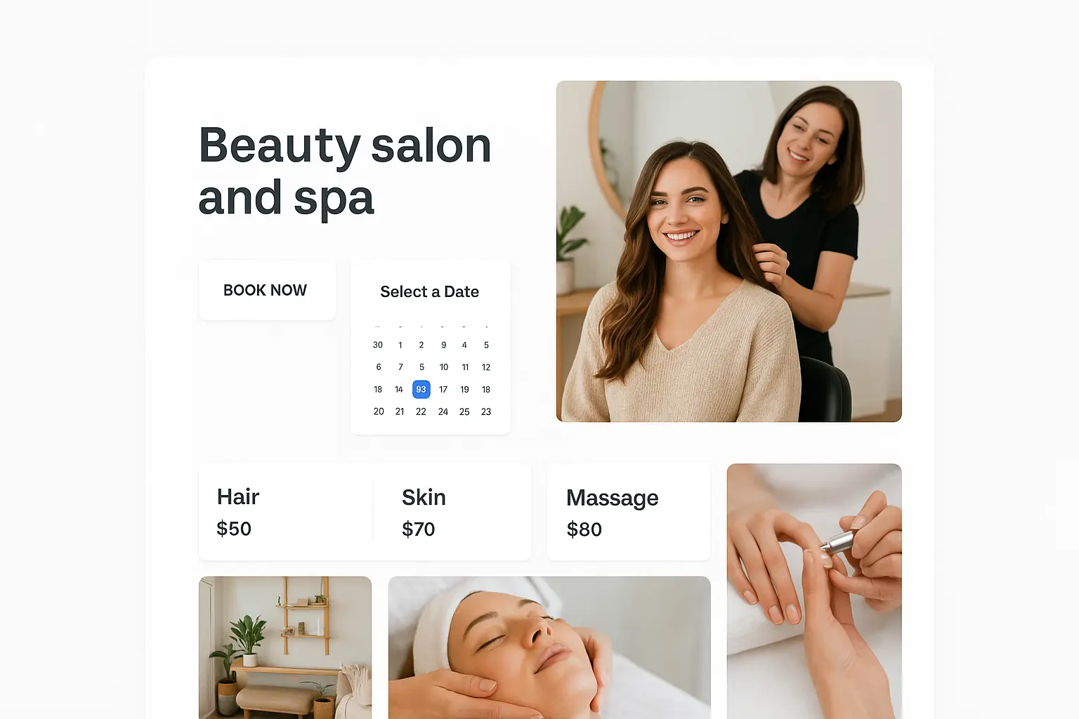
10. Beauty salon and spa landing page design
Booking a haircut, facial, or massage is an emotional decision as much as a practical one, so a beauty salon landing page has to sell atmosphere alongside services. Visitors want a sense of the experience waiting for them, not just a price list, which means visuals carry more weight here than almost any other niche on this list.
Design highlights
Rich imagery and an easy booking flow define the pages that perform well in this space. A gallery of the actual space, styled photography of past work, and a scheduling widget that doesn't require a phone call all reduce the friction between browsing and booking.
- Online booking widget synced to real-time availability
- Service menu with pricing shown by category (hair, skin, nails, massage)
- Instagram-style photo gallery of the space and completed work
- Introductory offer for first-time clients as the primary call-to-action
Why it converts
Visuals do most of the persuading in this industry. A page filled with real photos of the salon interior and stylist work builds more confidence than a paragraph describing the experience, since visitors are essentially shopping for a vibe before they shop for a service. Booking friction kills conversions fast here too, so a widget that lets someone pick a time slot at 10pm on a Sunday captures appointments a phone-only page would lose entirely.
Salon pages convert when the photos do the selling before the price list ever gets a chance to.
Membership or package pricing, shown clearly instead of hidden behind a consultation request, also helps visitors commit faster, especially for recurring services like color touch-ups or monthly facials.
Best for
This layout suits independent salons, day spas, estheticians, and nail studios building a local following through Instagram traffic and local SEO. It works especially well for businesses wanting to fill off-peak appointment slots, since transparent online booking captures last-minute openings a receptionist alone might miss.
11. Fitness and personal training landing page design
Gyms, personal trainers, and boutique fitness studios sell transformation, not just a service, so a fitness landing page needs to show real results before it asks for a commitment. Visitors browsing for a trainer or a new gym are usually comparing motivation levels as much as price, which means the page has to spark action fast instead of reading like a brochure.
Design highlights
Energy and proof drive this niche more than polish. Photos and video of real classes or training sessions beat staged stock photography every time, since visitors want to picture themselves in that environment.
- Free trial class or consultation offer as the primary call-to-action
- Before-and-after client transformation photos with real names or first initials
- Class schedule or trainer availability visible without a separate click
- Membership pricing tiers shown clearly instead of a "contact for pricing" wall
Why it converts
Motivation fades fast, so a page that makes signing up effortless captures visitors while they're still feeling inspired. A free trial offer removes the biggest barrier, the fear of wasting money on something they might quit, and gets them in the door where a good trainer can close the sale in person.
Fitness pages convert when the visitor can picture their own transformation in someone else's before-and-after photo.
Community matters just as much as results here. Short video testimonials from current members, especially ones mentioning specific coaches by name, build the kind of trust a generic five-star rating can't match on its own.
Best for
This structure suits personal trainers, boutique studios, CrossFit-style gyms, and yoga or Pilates instructors competing for local search traffic and social media leads. It works especially well for businesses running a service landing page design built around a specific promotion, like a 30-day challenge or new-member discount, since a focused offer converts better than a general "join our gym" pitch.
12. Auto repair and detailing landing page design
Car trouble usually strikes at the worst possible moment, so a driver searching for a mechanic or detailer wants a fast, trustworthy answer, not a scavenger hunt through a cluttered site. An effective auto repair landing page needs to prove competence quickly, since most visitors have never heard of the shop before and won't risk their car on a guess.
Design highlights
Clarity about services and pricing separates the shops that convert from the ones that get skipped. Visitors want to know upfront whether a shop handles their specific problem, whether that's a transmission issue or a full ceramic coating detail.
- Service menu split clearly between repair, maintenance, and detailing packages
- Online appointment scheduler tied to real shop availability
- ASE certification or manufacturer-specific training badges near the top
- Before-and-after photos for detailing work, mileage-based service reminders for repair shops
Why it converts
Speed to an appointment beats a beautifully written paragraph every time in this niche. A scheduler that shows open slots today or tomorrow closes visitors who might otherwise call three competitors before deciding. Detailing shops in particular benefit from photo proof, since a swirl-free paint job or a spotless interior sells itself faster than any description could.
Auto repair pages convert when the visitor can book a slot before they've finished comparing shops.
Pricing transparency also matters more than owners expect. Even a rough estimate range for common services, like an oil change or brake job, keeps price-sensitive visitors from bouncing to a shop that lists numbers openly.
Best for
This layout suits independent mechanics, quick-lube shops, and mobile detailing businesses competing for local search traffic around specific neighborhoods. It works especially well for shops running paid ads, since a dedicated page matching the ad's exact service keeps cost per booked appointment lower than sending traffic to a generic homepage.
13. Restaurant and food delivery landing page design
Hunger doesn't wait, so a restaurant landing page has to load fast and answer one question immediately: can I order or reserve a table right now. Visitors searching for a nearby restaurant or checking out a delivery option are usually deciding in seconds, not scrolling through a full menu story about the chef's background before they act.
Design highlights
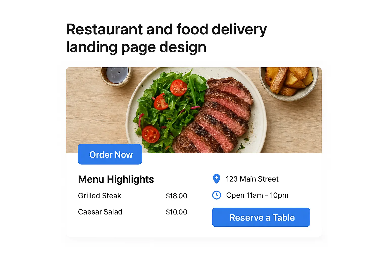
Food photography carries this niche more than any other on the list, since people order with their eyes before their stomach. The page needs to get visitors from craving to order in as few taps as possible.
- High-quality food photos above the fold, not stock images of generic dishes
- Order-now or reserve-a-table button as the primary call-to-action, repeated at each scroll section
- Menu highlights with prices instead of a PDF download nobody opens
- Delivery platform links (or a native ordering system) placed prominently, not buried in the footer
Why it converts
Friction kills orders faster than in almost any other industry, since a hungry visitor will bounce to a competitor the moment a page feels slow or confusing. Pages that skip the PDF menu and show dishes with prices directly on the page convert better because visitors can decide without downloading anything or squinting at a scanned image.
Restaurant pages convert when ordering takes fewer taps than opening a delivery app instead.
Location and hours also need to be obvious immediately, since a wrong assumption about whether you're open sends visitors elsewhere in seconds. A map, current hours, and a phone number belong near the top, not tucked into a contact page three clicks away.
Best for
This structure fits independent restaurants, cafes, food trucks, and ghost kitchens relying on local SEO and delivery app traffic. It works especially well for spots running lunch or dinner promotions, since a focused offer on the landing page drives faster decisions than a full static menu ever could.
14. Financial and insurance services landing page design
Shopping for a financial advisor or an insurance policy means trusting a stranger with money decisions that affect years down the road, so a financial services landing page has to build credibility before it asks for a single detail. Visitors in this niche are naturally skeptical, often after a bad experience with a pushy salesperson, which means the page has to feel more like guidance than a pitch.
Design highlights
Education-driven layouts outperform sales-heavy ones here. Visitors want to feel informed, not sold to, so the page should explain options clearly before pushing toward a form.
- Free quote calculator or rate comparison tool as the primary call-to-action
- Advisor or agent credentials (licenses, years in practice, specialties) shown near the top
- Plain-language explanations of coverage types or investment options, no dense jargon
- Client testimonials focused on claims handled well or advice that paid off
Why it converts
Specificity builds trust faster than broad promises in this space. A page naming exact products, term life, small business insurance, retirement planning, converts better than one offering vague "financial guidance" language. Visitors want to see their exact need addressed before they'll hand over contact information.
Financial pages convert when the visitor feels informed enough to make a decision, not pressured into one.
A quote tool that gives a real number, even a range, keeps visitors engaged longer than a form promising a callback with no other detail. Since these decisions often involve a spouse or business partner, a page that's easy to share or revisit also keeps leads from going cold.
Best for
This structure suits independent insurance agents, financial advisors, and small firms competing for local search traffic against national brands with far bigger ad budgets. It works particularly well for agents specializing in a specific product, like small business insurance or retirement accounts, since a focused page outperforms a generic "all your financial needs" homepage.
Turning these examples into your own page
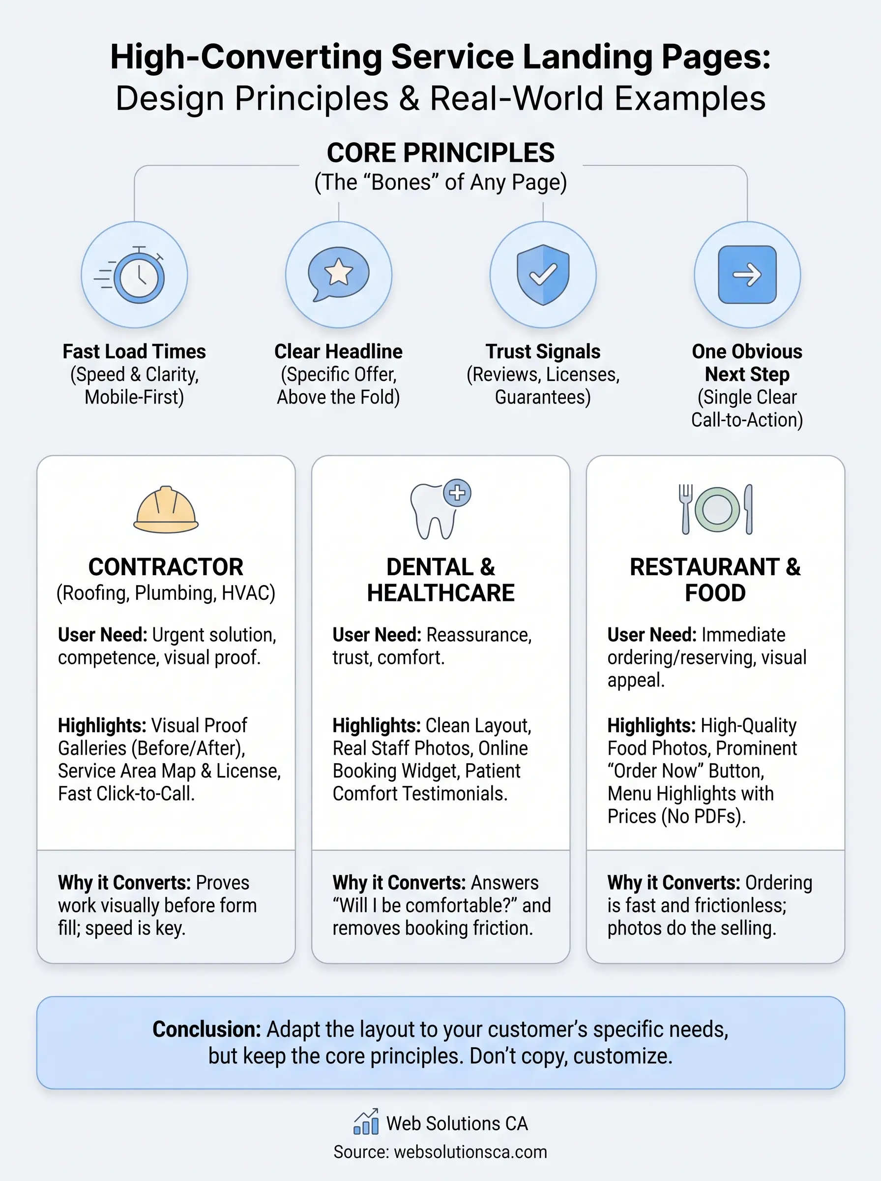
Every example above shares the same bones: a clear headline, fast load times, trust signals placed where visitors actually look, and one obvious next step. The industry changes the details, but the conversion principles stay identical whether you're booking a facial or quoting a roof repair. Good service landing page design isn't about copying a template, it's about matching the layout to what your specific customer needs to see before they'll call or fill out a form.
Start by picking the example closest to your industry, then strip out anything that doesn't earn its place above the fold. If you're staring at a page that's underperforming and not sure where the disconnect is, that's exactly what we handle every day. Get a custom landing page built for your business and stop guessing why visitors leave without calling.